There has been much talk lately about the use of the electoral college in the United States, and renewed interest in whether or not the process remains fair in our modern world. After more than one election in recent memory has been decided not by the popular vote, but the electoral college, most engaged people will admit it’s definitely been on their minds.
What would the states look like, though, if they stretched to encompass equal population?
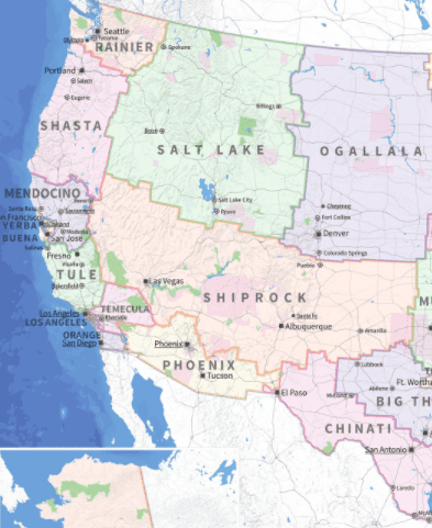
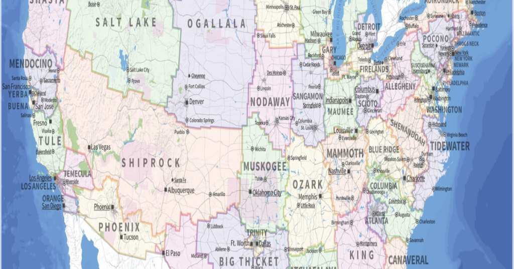
Well, artist Neil Freeman set out to create a map to help us visualize exactly that, and some of the largest states in the country are even bigger, now.

Image Credit: Neil Freeman
The visual reference for what it take for the electoral college vote to match the popular vote – for every state to be evenly weighted – is pretty handy (and also hard to wrap your head around at first.
“The largest state is 66 times as populous as the smallest and has 18 times as many electoral votes,” wrote Freeman on his website.

Image Credit: Neil Freeman
He based his map on 2010 Census data, which shows a total national population of 308,745,538. If you divide that evenly over 50 states, each on receives a little over 6 million people.
Freeman gave the new states cute names largely based on their geological features and I, for one, think we should lobby to change them officially.

Image Credit: Neil Freeman
Though interesting to consider and slightly baffling to visualize, Freeman reminds us that “this is an art project, not a serious proposal. So take it easy with the emails about the sacred soil of Texas.”
Because it had to be the Texans. Of course.
What are your thoughts? Anything surprise you about the map? Let us know in the comments!


