There’s been a lot of talk in recent years about how Daylight Savings Time is the worst, how no one really understands why we still do it, and couldn’t we just decide to stop it already?!
Recently, Congress decided we’re going to stay on Daylight time permanently in the coming years and even that has caused controversy – because of course there are the folks who think they should have chosen standard time instead.
But how much does the time shift really affect you where you live?
For instance, if you’re someone who lives in the Eastern time zone, your benefits from the time change can still vary – people in New York City get 40 minutes more sunlight in the morning than those in Detroit, as an example.
To illustrate how some people are reaping far more sunshine and happiness than others, cartographer Andy Woodruff put together a series of pretty eye-opening maps.
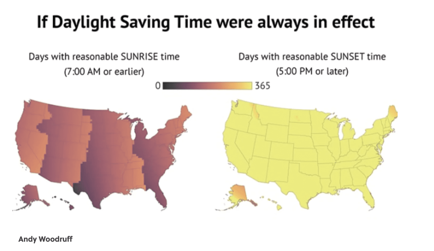
In this one, the map on the left shows how many days of “reasonable” sunrise time (7am or earlier) people are getting across the country. If your section is yellow, you’re getting more reasonable sunrises than the people living in the dark (literally and figuratively).
On the right is a similar map but deal with reasonable sunset times, defined as anything past 5pm.

Image Credit: Andy Woodruff
The next set of maps helps you visualize how we would be living if we chose to live on standard time year round, which looks like sunset times that stay pretty much the same but mornings that are sunnier across the board.

Image Credit: Andy Woodruff
If we choose to stick with Daylight time, which is what looks like is set to go into effect soon(ish), our mornings would be spent in the dark – but hey, who likes mornings anyway?
Our evenings would be brighter and longer and better to get things done after work.

Image Credit: Andy Woodruff
If you head over to his blog you’ll find interactive versions of his maps that let you play with the times and regions yourself, so go wild!
Now that you’ve seen these visuals, what are your thoughts on what’s being proposed/implemented?
We’d love to get your take on it in the comments!


