
Hidden Messages In Famous Logos You Won’t Be Able To Unsee
It may seem shocking that companies will spend thousands designing a logo, but it has been proven that a clever logo can go a long way. Pepsi was even said to have spent $1 million when they redesigned their logo in 2008. For most of us, we don’t even look twice at logos, but with a second glance, you can see the artistry of the marketing moguls behind them.
But whether or not the logo was made by a team of professionals, or drawn up on the back of a napkin, there is no denying that these logos might just blow your mind. Check out these logos and see if you can figure out their hidden messages.
Goodwill
Almost anyone who has shopped second-hand or donated can recognize the smiling half-face of the Goodwill logo. But how many of us have simply moved on without noticing the real hidden symbolism hiding in here? It’s not in the picture, but rather the “G” is “Goodwill” is the same face as the logo, but it goes unseen with a different color background.
Goodwill’s hidden logo shows that the message isn’t always in the image, but hiding somewhere else.
Pittsburgh Zoo
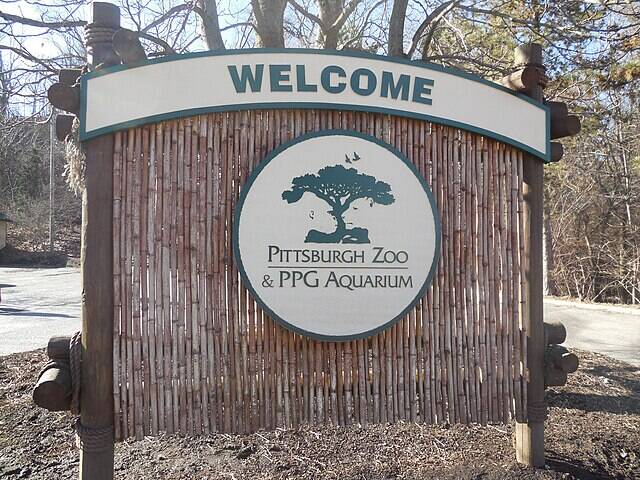
The logo for the Pittsburgh Zoo appears pretty obvious at the start. A tree with birds flying overhead, very outdoorsy and a great symbol for a zoo, right? But looking closer at the negative space around the tree, you’ll see a gorilla and lion face staring at each other.
If you saw the two animal faces right away, good job. But did you also spot the three fish jumping out of ‘water’ at the base of the tree? This is the logo that keeps on giving.
The Tour de France
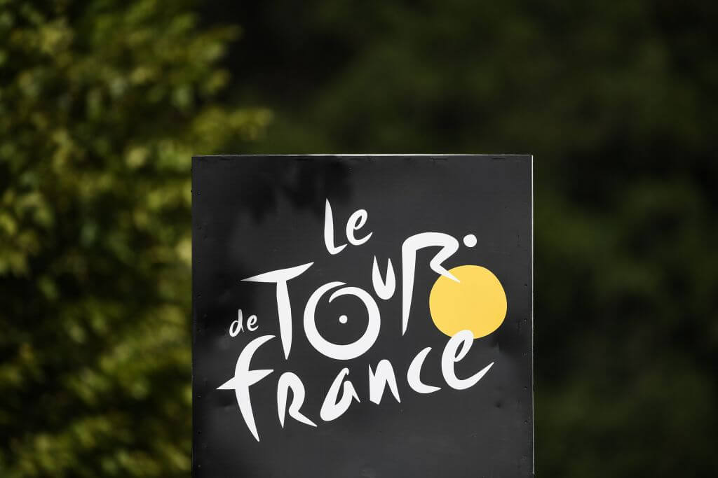
On the surface, the logo for Le Tour de France, the famous 3-week cycling race that takes place each year in France, seems like modern, abstract script. But when you focus in on the word “tour” the image turns from simple script to an ingenious logo.
The yellow circle is meant to reflect the iconic yellow jerseys worn by the winner of each stage in the race, but it doubles as the front wheel of a bicycle. The “O” in “tour” makes the back wheel, with the “R” transforming into the rider. The logo was introduced in 2003 for the 100th anniversary of the race and was so powerful that it has remained ever since.
Amazon

As Amazon has grown into a billion-dollar company, it’s logo has been so effective that it has stayed relatively the same. Everyone loves Amazon because it basically sells everything you can think of, which is why their logo that shows an arrow going from A to Z, is genius.
The logo was not always this clever. The first rendering of the Amazon logo that appeared in 1994 when Jeff Bezos founded the company and sold primarily books, would be unrecognizable to most. In 1998, they redesigned the logo to be closer to what we know today and expanded to books, music, and more. But finally, in 2000, they began to expand their products and introduced the logo with today’s hidden message.
Baskin-Robbins
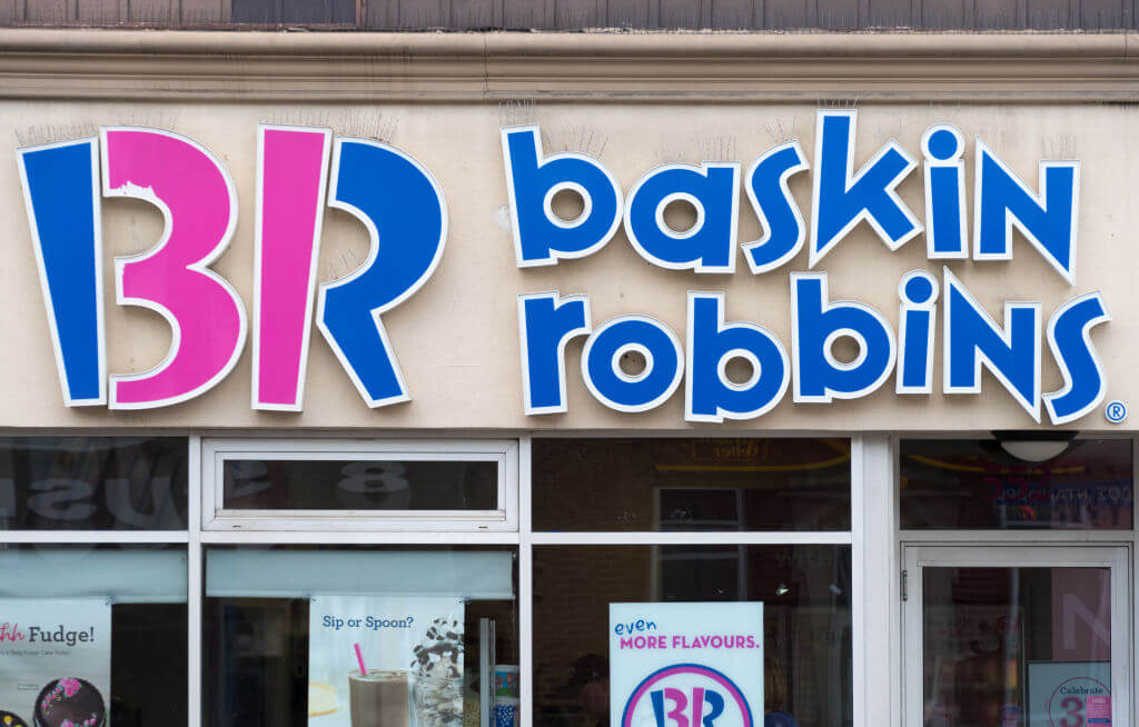
The logo for the famous ice cream chain envokes a bit of childhood creativity. The fun colors and font seem like a child could have scribbled it on a napkin and that’s why many love it. But no child could have snuck this hidden message in so easily.
The color-blocking adds to the childish style, but look closely and you’ll see the pink is meant to emphasize a “31” for the original 31 flavors that Baskin-Robbins opened with in 1948. It makes sense why, to this day, they still want to emphasize the 31 flavors. They were the first ice cream parlor to introduce sampling before buying, and I think we are all very thankful for that.
Houston Rockets
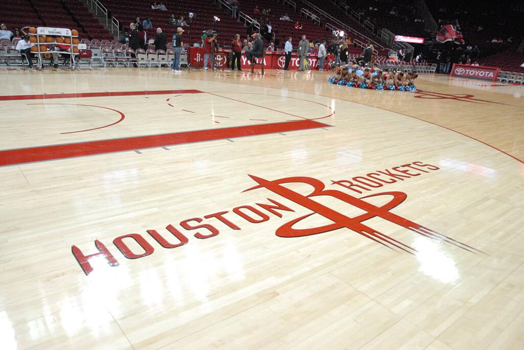
The Houston Rockets are an American professional basketball team based out of Houston, Texas, and their logo is a clever use of symbolism and text. The “R” is actually meant to symbolize a rocket taking off. But not only that, the rocket is taking off through a stylized basketball hoop. Even better, the hoop crossing over the “R” rocket forms a hidden “H”.
The Houston Rockets were originally the San Diego Rockets back in 1976, named after the missile and rocket program being developed at the time. When the team moved to Houston, they kept the name. Even though not many of us would associate rockets with Houston, Texas, their logo does a good job of making us think twice.
Toyota
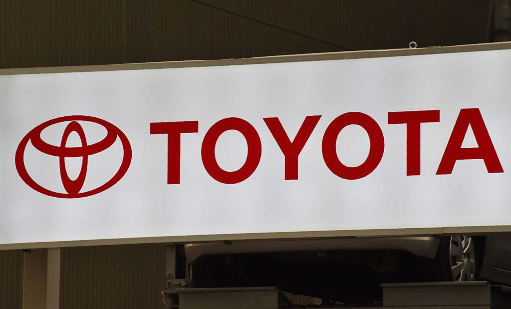
Toyota’s logo has been up for much debate, but everyone can agree there’s something more to it than meets the eye. Officially, the three ellipses “symbolize the unification of the hearts of our customers and the heart of Toyota products. The background space represents Toyota’s technological advancement and the boundless opportunities ahead.”
But unofficially, many have speculated that they look suspiciously like a thread passing through an eye of a needle, paying homage to Toyota’s start in the textile industry.
Nintendo Game Cube
On the surface, it appears to simply be a stylized cube, which would make sense given the console’s name. But take a step back, squint if you need, and you’ll see the cube actually forms a letter “G” and the negative space within outlines a “C”, standing for Game Cube.
If you were into video games in the early 2000’s, you were probably too busy playing on this groundbreaking game system to appreciate the incredible logo design. Once again, using that negative space can be the most creative way to hide your brand in the logo.
FedEx
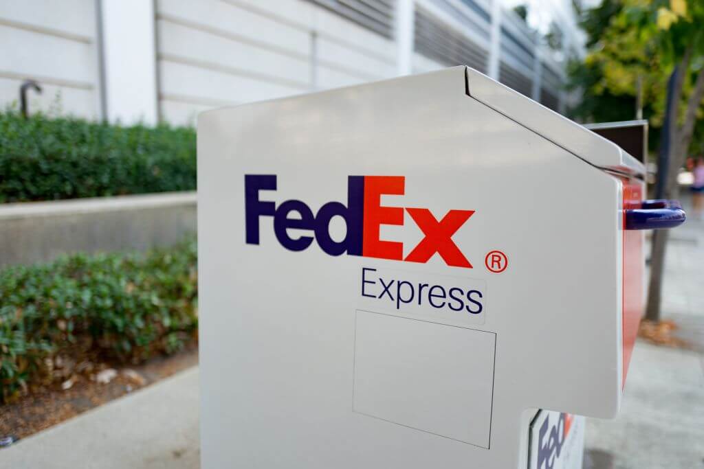
FedEx, much like Amazon, is basically everywhere now. Their logo is recognizable and holds a hidden symbolic message which embodies their brand perfectly. Between the negative space of the “E” and the “x”, an arrow is formed which points right, the direction most would associate with pointing forward.
Similar to Amazon, when the company was founded in 1971, the clever logo didn’t exist yet. It wasn’t until 1994 that they rebranded and the clever logo was created. The arrow is said to symbolize “speed and accuracy.”
Tostitos
Most of us don’t look twice at the logo for Tostitos because we’re too busy eating whats inside the bag. But if you take time away from dipping your chips in their salsa, you’ll notice you have two other guests with chips and salsa. The Tostitos logo shows two people sharing a tortilla chip over a bowl of salsa.
This logo was introduced in 2003 to expand on the original logo, which included the red dot over the “I” but no hidden message. The brand’s choice to redesign the logo served them well, as this hidden message is a commonplace cocktail party fact.
Formula 1
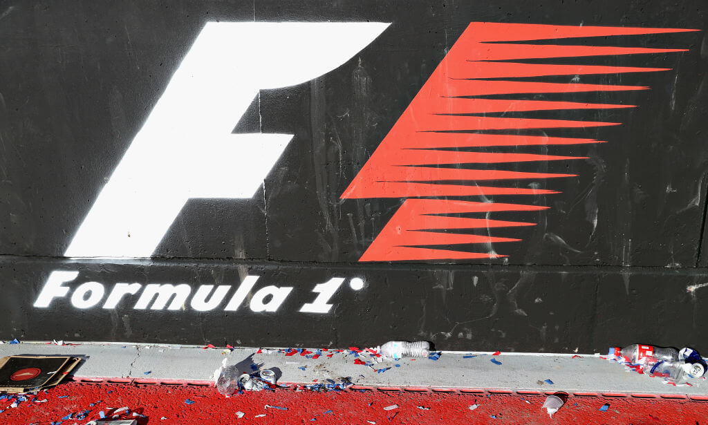
Formula One, or F1, is a top auto racing competition with a top-notch logo to match. The logo uses negative space and symbolism to communicate the race’s core elements. Between the white “F” and red stripes, a “1” can be seen. The red stripes top off the logo and give off an idea of speed and power.
Formula One has always put time and care into their logos. Before this logo appeared in 1994, their logo utilized negative space in a different way by having a racecar cut out of their text. They definitely know how to use a logo to their advantage.
BMW
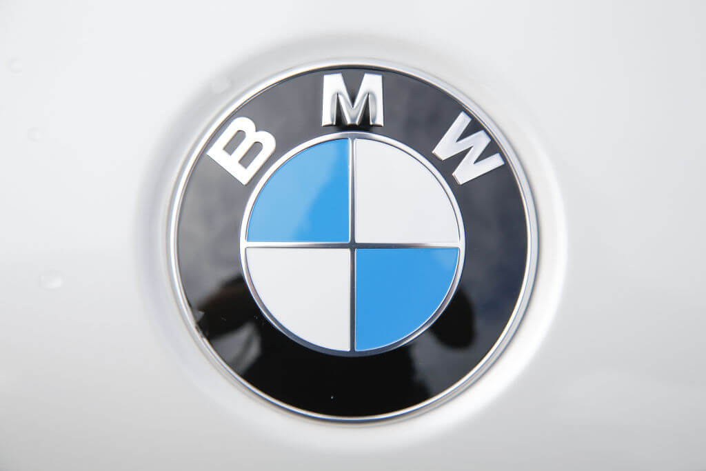
The BMW logo has been controversial with two competing theories on what it truly means. The longstanding idea is that the blue and white are representative of a propeller since the company originated as an engine manufacturer after WW1.
The other competing theory is that the blue and white are a homage to the flag of Bavaria, where the company began and the products are manufactured. Whatever the reason is, this logo makes the consumer think, which just adds to brand recognition.
LG
There’s a lot more going on in this logo than meets the eye. So I didn’t even realize that at a quick glance, this kind of looks like a winky face. Now it’s all I can see.
However, in that face you can clearly see that the nose makes an ‘L’ and the outline of the face is a ‘G’. Also, if you have that L fill in the missing space just above, you’d get the Pacman logo.
Beats By Dre
Sure, this might just look like the letter ‘b’ is sitting on a circle to stand for the word ‘beats,’ but there’s even more to take in. The iconic logo actually makes it look like a someone wearing a pair of headphones.
It’s just those little extras that really make it easy for people to look towards the brand that made Dr. Dre a billionaire.
Delta Airlines
This isn’t so much of a hidden logo. It’s more of clever use of the Greek alphabet. The little triangle next to the word ‘Delta’ is, in fact, the Delta symbol, which is also the fourth letter of the Greek alphabet.
Dallas Mavericks
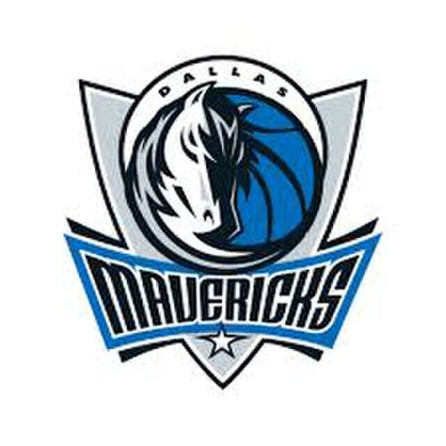
This one looks like there could actually be a tone of things going on behind the curtains. I’ve seen this logo a bunch of times and can never really tell if the horse is just one, two-faced horse or two horses resting their heads against each other.
But what’s really hidden is the fact that the letter ‘M’ is sitting on the top of the horses head. It probably stands for ‘Mavericks’ but they are owned by Mark Cuban… so who knows?
Hartford Whalers
So, the Harford Whalers haven’t been an NHL team in forever, and I can’t say their logo did them any favors. Yes, there is a fin sitting out of the top to make everyone very aware that they’re named after the whale, but all I can see is the Little Mermaid.
What’s that actual hidden part is the ‘H’ that’s sitting smack dab in the middle of the logo.


