
15+ Design fails that are sure to cause some major headaches
Sometimes you stumble upon something that just makes you pause, blink, and maybe even chuckle in confusion. From baffling signs to peculiar design choices, here are some moments that are as puzzling as they are hilarious. Get ready for a perfectly imperfect parade of ‘did anyone test this first?’ situations!
“Watching My Walmart Cashier Struggle to Simply Spell “Water””
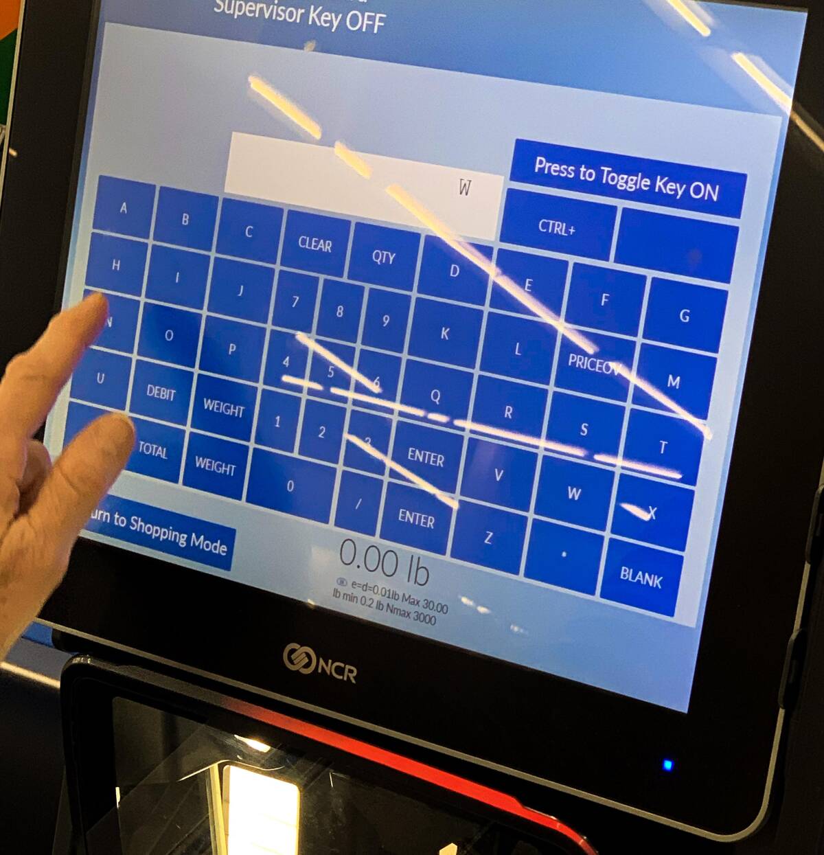
Watching someone try to spell ‘water’ on this screen is unintentionally mesmerizing. It’s like a puzzle game except the prize is hydration. You’d think typing on a screen would be easy, but somehow this keypad turned it into an epic struggle. Technology: always here to keep you humble.
“It’s Pretty Good Advice”
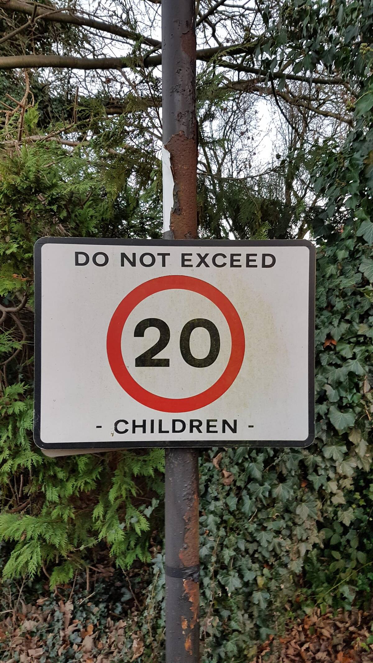
Nothing beats motivational signage that feels just a bit threatening at first glance. Good advice is sometimes all about the delivery, I guess? Imagine driving home, reading this, and wondering how many children is *too* many. It’s both practical and oddly alarming—way to keep parents on their toes.
“Looks like Stanford needs some basic math lessons.”
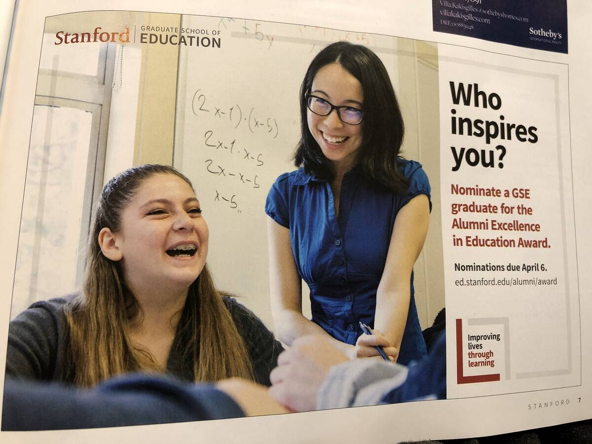
Yeah, the math on this one doesn’t quite add up. When the prestigious university promo is outsmarted by its own whiteboard. Inspiring future leaders in education is great, but someone should have checked that equation first. We can all laugh, though—not just those who know algebra.
“This trashcan at Frankfurt Main Station.”
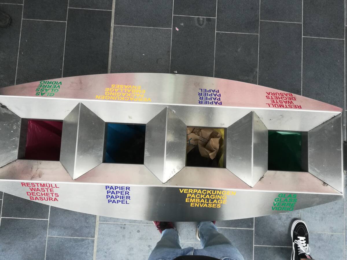
Sorting trash here feels like a game show where everyone loses. By the time you figure out which compartment is correct, you’ve probably created new waste. Is it a color puzzle, a multilingual test, or part of an escape room challenge? Whatever it is, it’s definitely not relaxing.
“I saw this on a box. I don’t know how to lift it like the picture said”
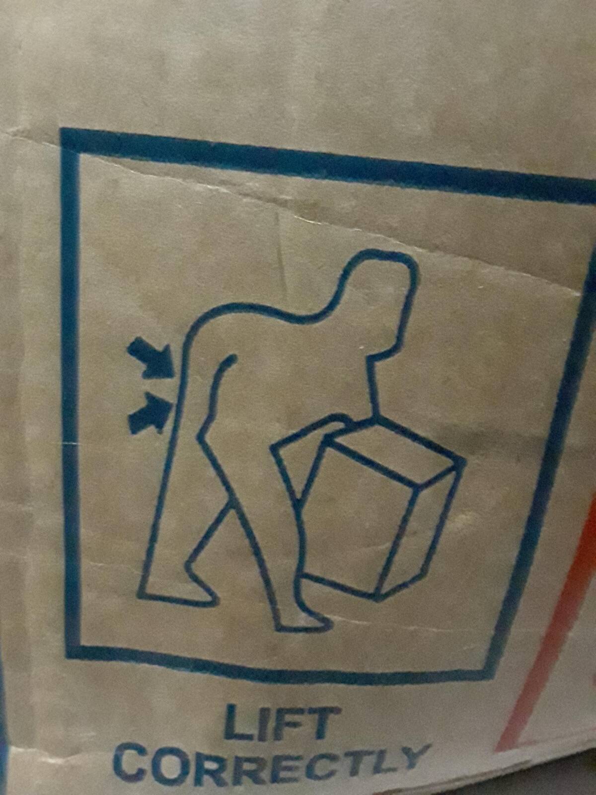
I’ve never seen a lifting diagram so oddly specific and yet completely unhelpful. Am I about to pull a muscle or invent a new move? Of all the things to emphasize, they chose this? Thanks for the visual, but now I have more questions than answers about lifting boxes.
“(unintentionally gross) marble looking keyboard”
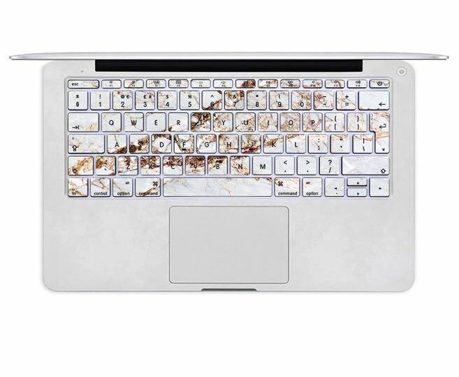
Oh wow, that texture is doing no favors to a keyboard. At first, I thought something terrible happened here, but it’s actually meant to look like that. It’s a bold look, but I’m not sure anyone asked for ‘marbled with mystery stains’ as a laptop aesthetic.
“Why does blue represent 2 things…”
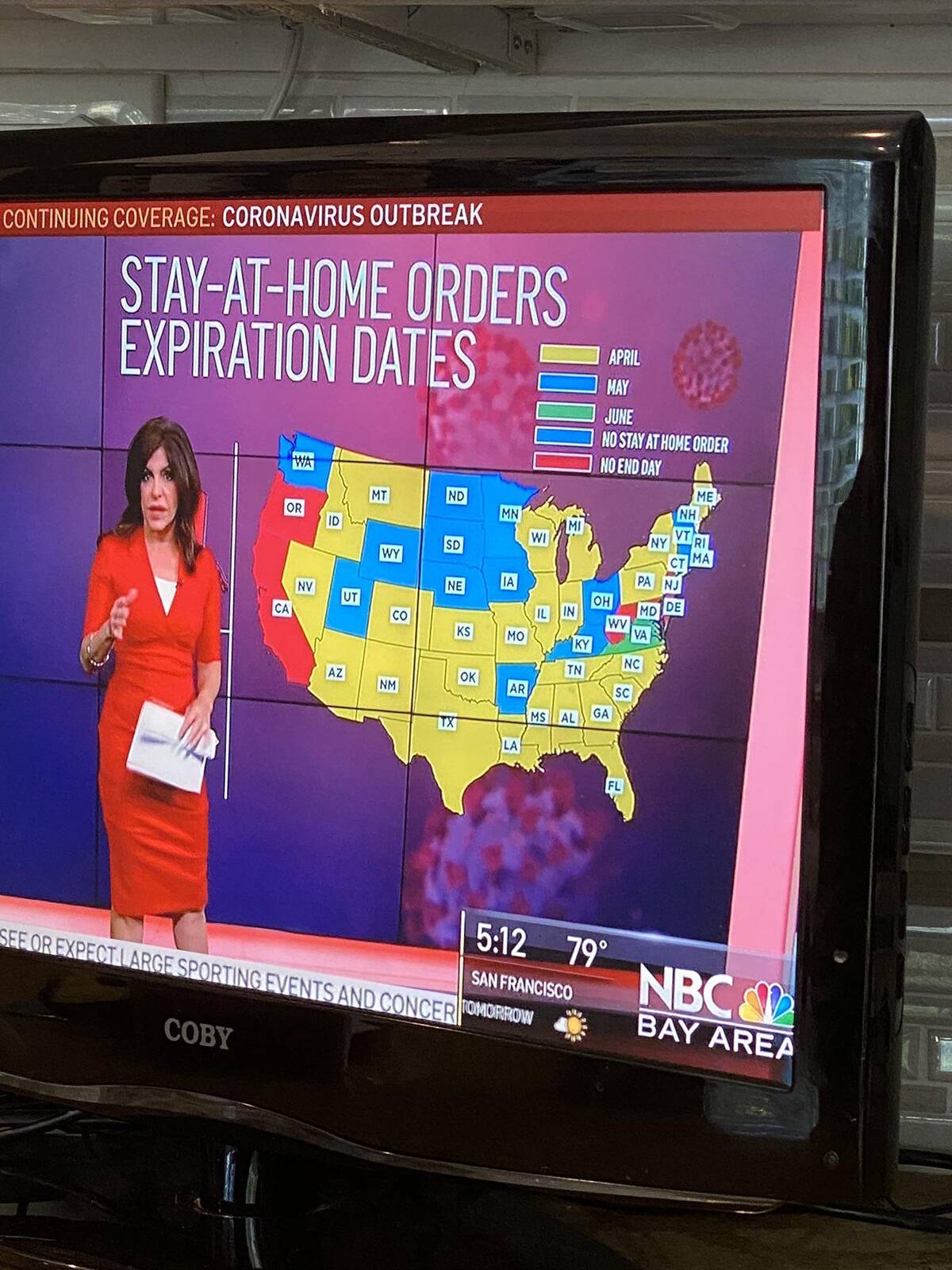
Trying to decode which blue means which thing here is a new level of chart anxiety. At this point, the color key is more confusing than the map. We’ve got all this fancy info, but the legend is like a riddle you solve only after you don’t need it.
“Look closely between the 7.5 and 8.0”
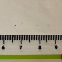
On this ruler, let’s play ‘spot the micro-gap.’ Just when you think you can trust your measuring tools, they go and get creative. I guess even numbers need personal space sometimes! Someone should let the manufacturer know precision is kind of a thing.
“My son is too terrified to learn anything from these speech therapy worksheets, and frankly I don’t blame him”
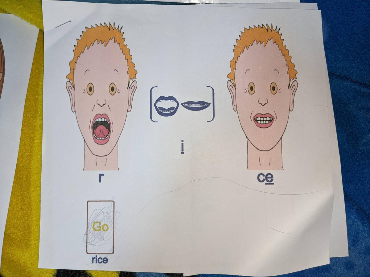
Is this a worksheet or a scene straight from a low-budget horror movie? No wonder the poor kid is scared to practice speech. There are better ways to illustrate sounds than nightmare-fuel drawings that haunt your dreams. Speech therapy just got spookier.
“This doormat belonging to a couple living in my building.”
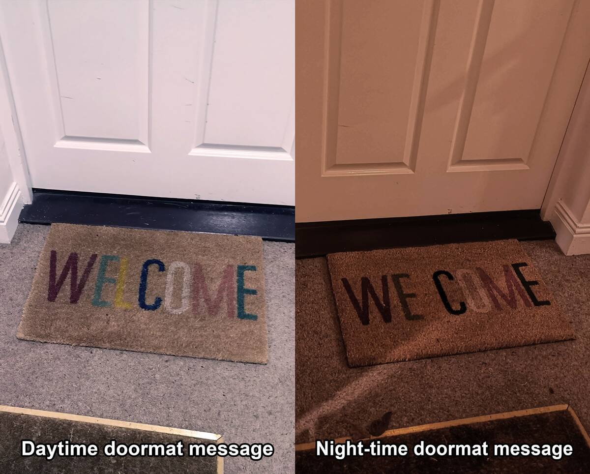
Now that’s a welcome mat with dual personalities. By day, you’re greeted warmly—at night, things get a little more ominous. I imagine guests hesitating for a second after dark.
“Professor, I can’t get these audio files in our textbook to play”
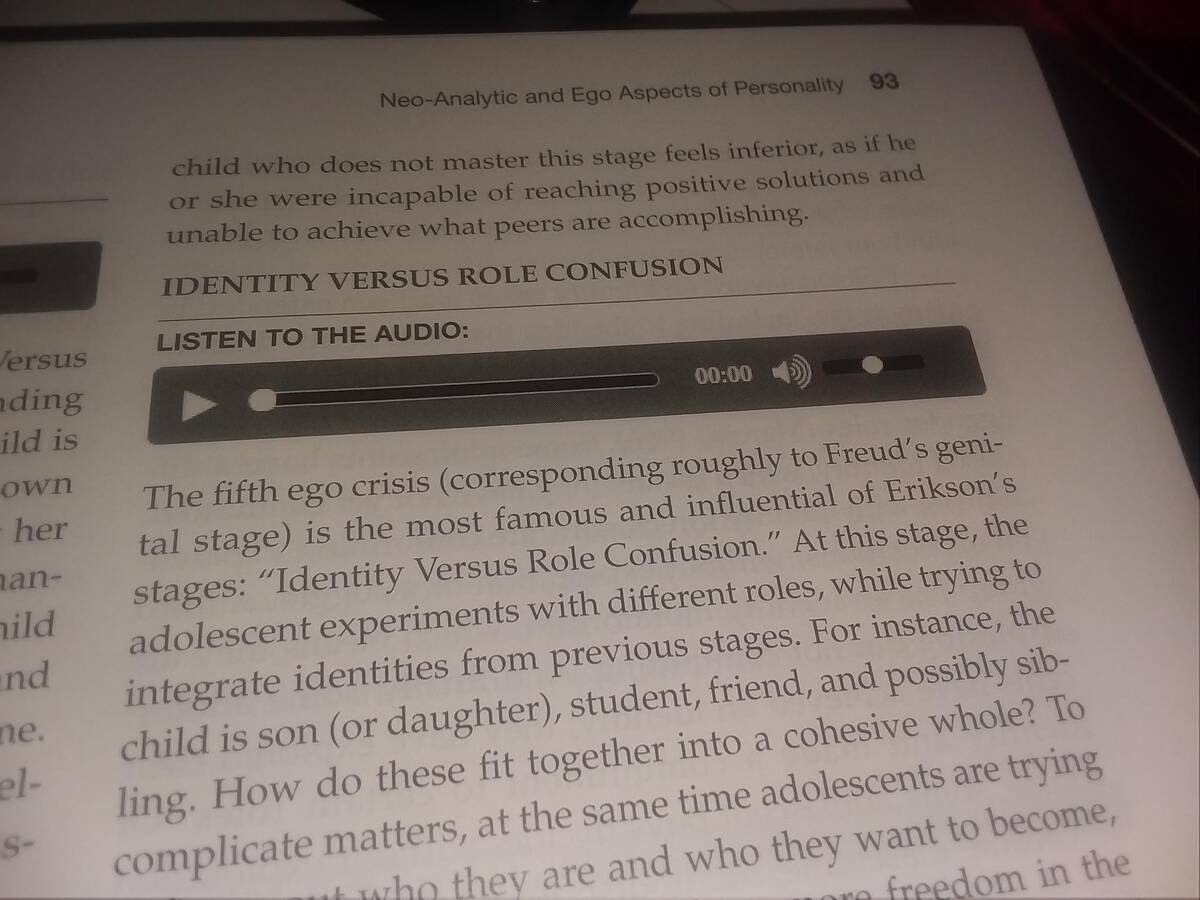
Textbooks just keep getting fancier. Now you can listen to embedded audio, provided you have supernatural powers to interact with paper. Checking my physical book for the play button—yep, still not a thing. Let’s hope teachers aren’t assigning these audio tracks for homework.
“This Spiderman children’s ride has a visible panty line.”
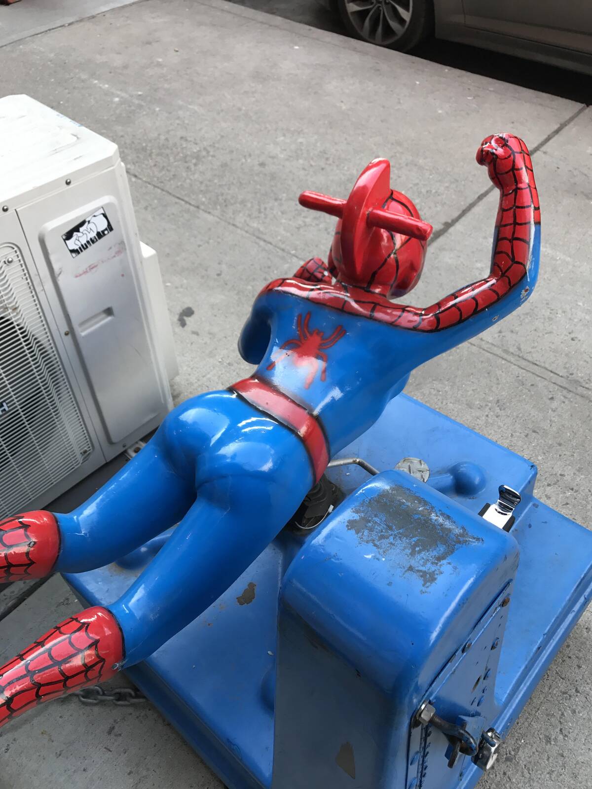
Never thought I’d see the day where Spiderman got a costume with, uh, extra definition. This ride is way too anatomically detailed for its own good. The kids just want to swing, not analyze unintended wardrobe malfunctions. Who approved this superhero sculpting session?
“The words they chose to have standout color”
Sometimes highlighting words just leads to… interesting results. Looking at this layout, I’m not sure if I should feel confident or deeply confused. The intent was good, but the takeaway might not be what they were expecting! At least it gets your attention.
“The DESIGN SCHOOL I graduated from sent this postcard out”
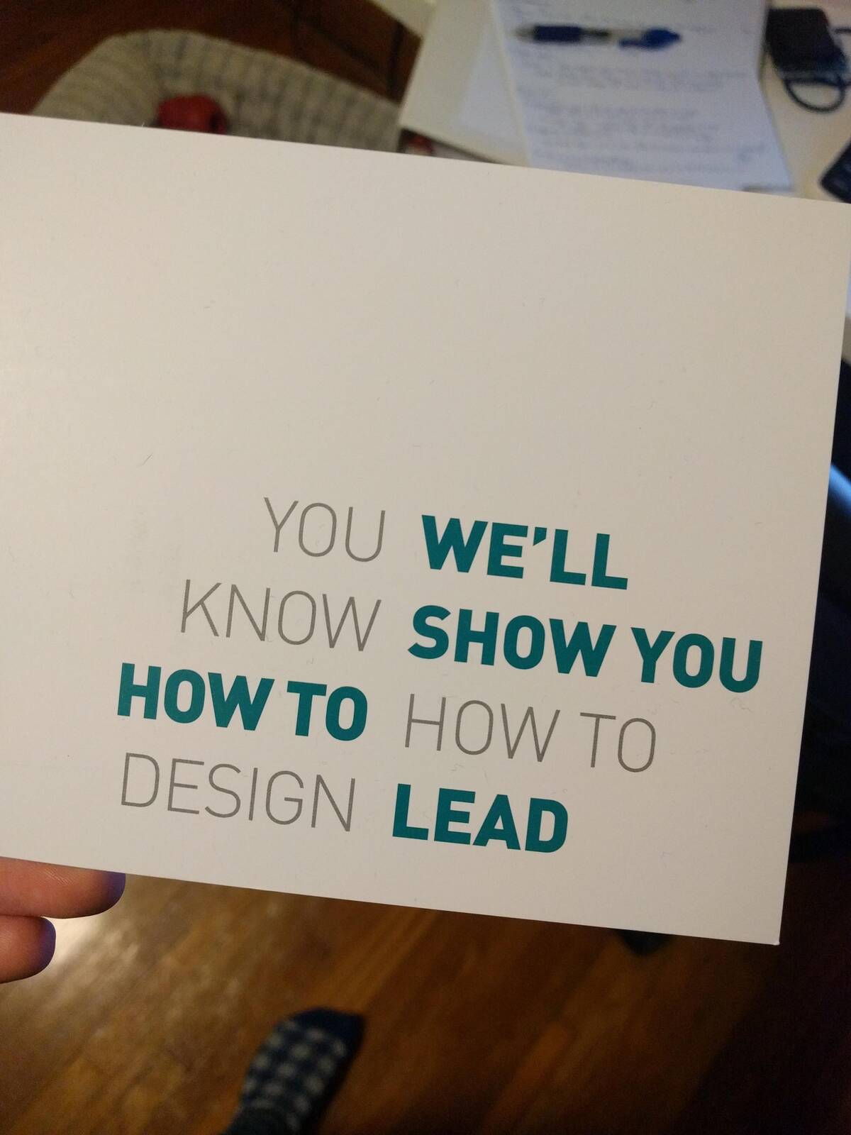
When your design school prospectus is itself confusing to decode, maybe it’s time for a curriculum update. Reading this feels like a test I didn’t study for. If you can actually unravel this message without a headache, you’re probably overqualified to graduate already.
“This graph”
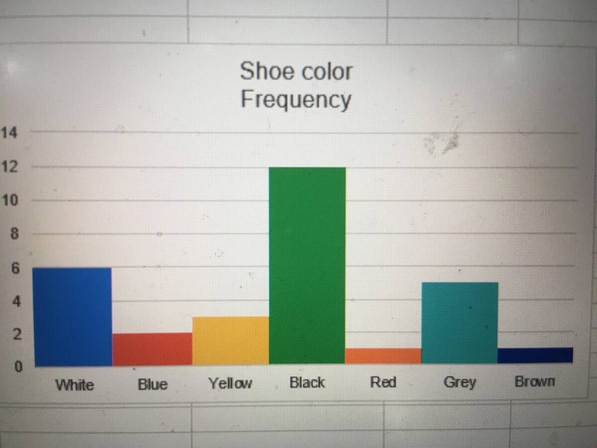
I love a good bar graph, but shoe color frequency has never looked so random. Some colors are taking center stage while others just exist for moral support. If you needed a visual on chaos theory in action, this would be a solid candidate for your next presentation.
“The quotation marks on this sign gives it a malevolent undertone…”
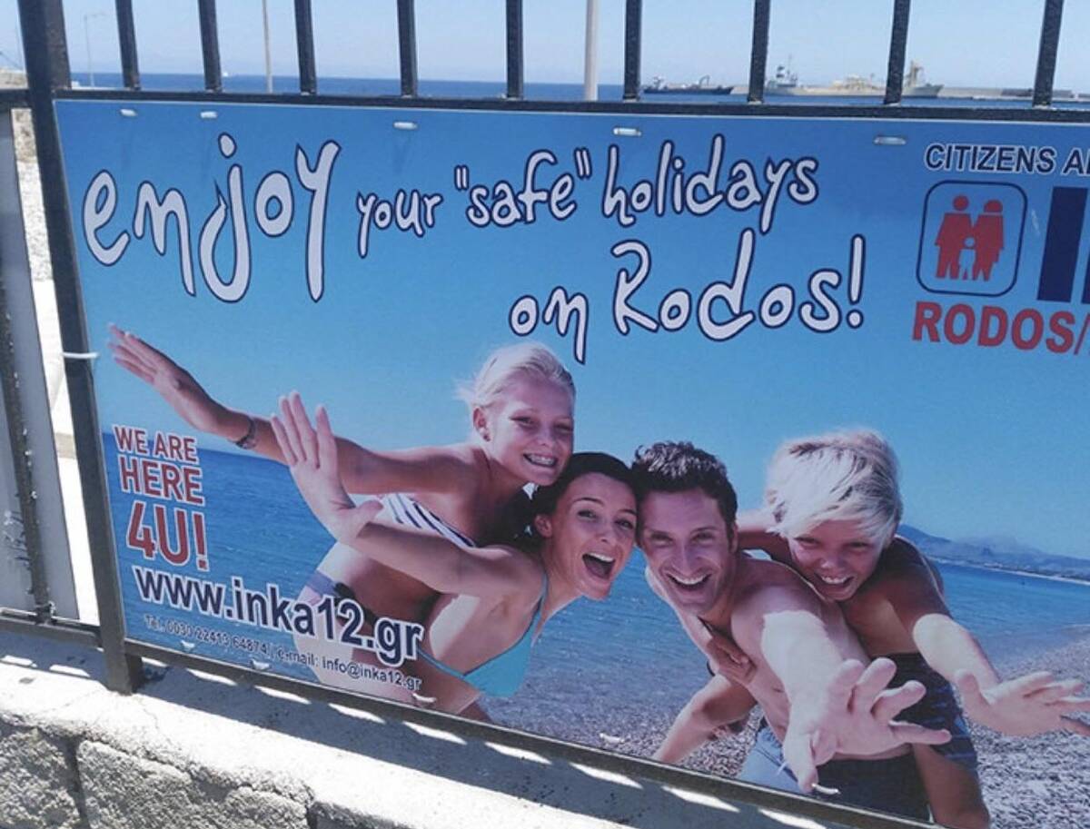
Putting quotation marks on ‘safe’ just hits differently. Do they know something I don’t? Because now I definitely want to double-check my travel insurance. Welcome to your ‘safe’ holidays—now in extra-uncertain flavor! Fingers crossed it’s just an issue with translation and not a warning.
“My school’s official anti bullying presentation. Every title slide is the same way.”
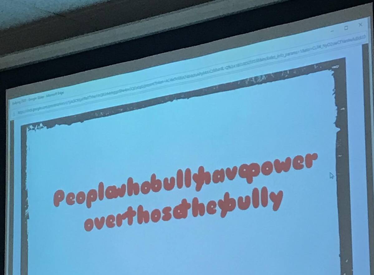
When your anti-bullying presentation slide looks this hard to read, I think the message might get lost in translation. Solid effort, questionable results. A font choice can make or break a message—and in this case, it’s mostly breaking my spirit as a reader.
“Uh.. how would I…..know”
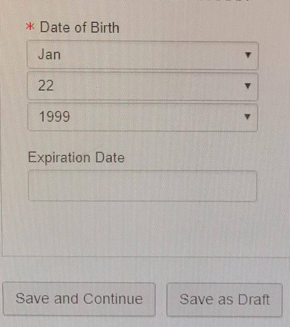
Sometimes forms are just here to remind us that life is uncertain and mysterious. Expiration date? Who knows—maybe it’s philosophical. All I wanted was to sign up, not contemplate my own mortality. Next time, just let people say ‘forever.’
“This soldering iron has a screw on the handle direct connected to the heat source. It was burning surprise to say the least.”
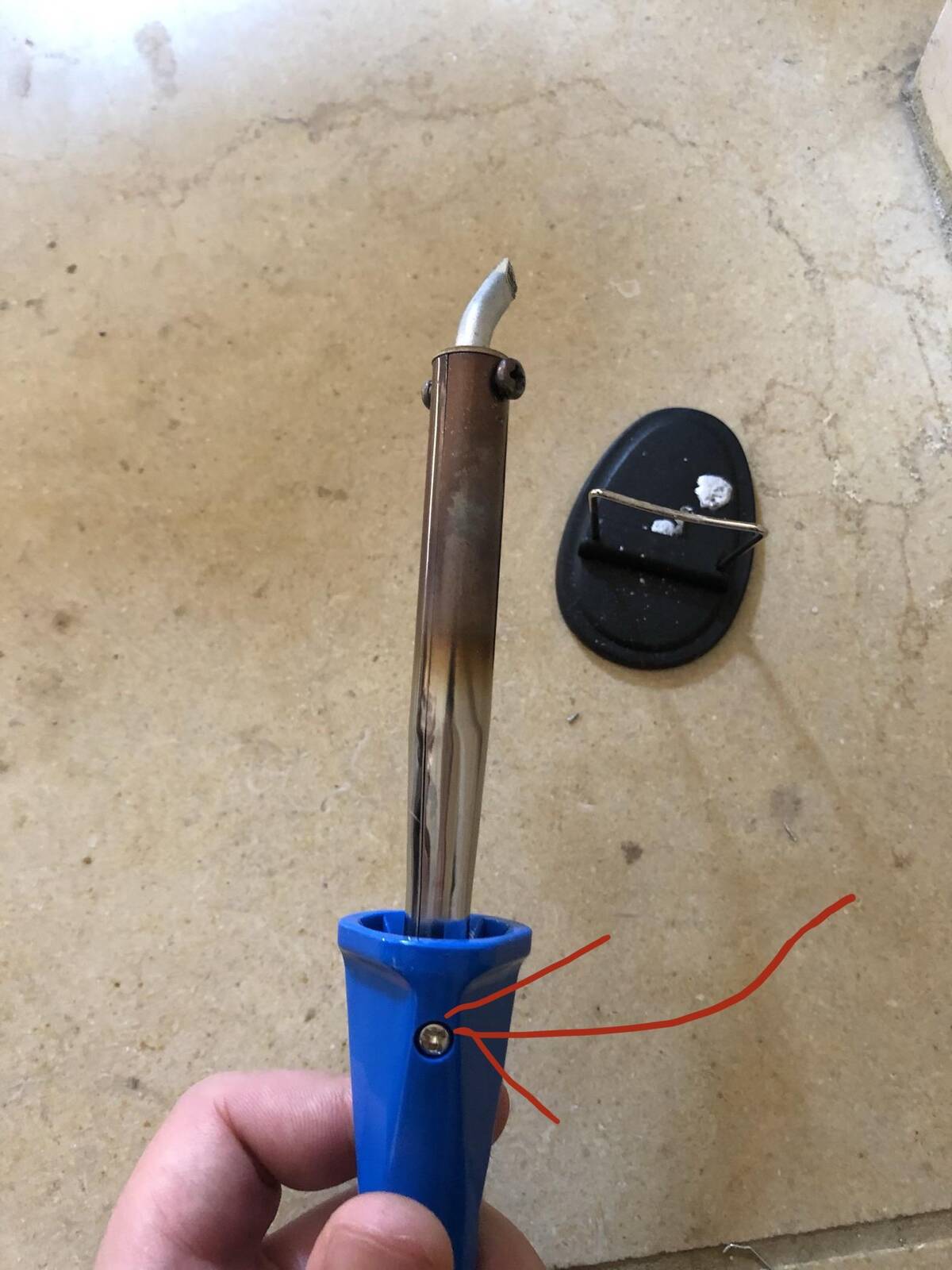
This soldering iron really wants to give you some real ‘hands-on’ learning—starting with an unexpected burn. Design flaw or extreme wake-up call? When safety screws lead directly to the danger zone, you know something went sideways in production. Keep those safety gloves handy!
“This candle melts its own container”
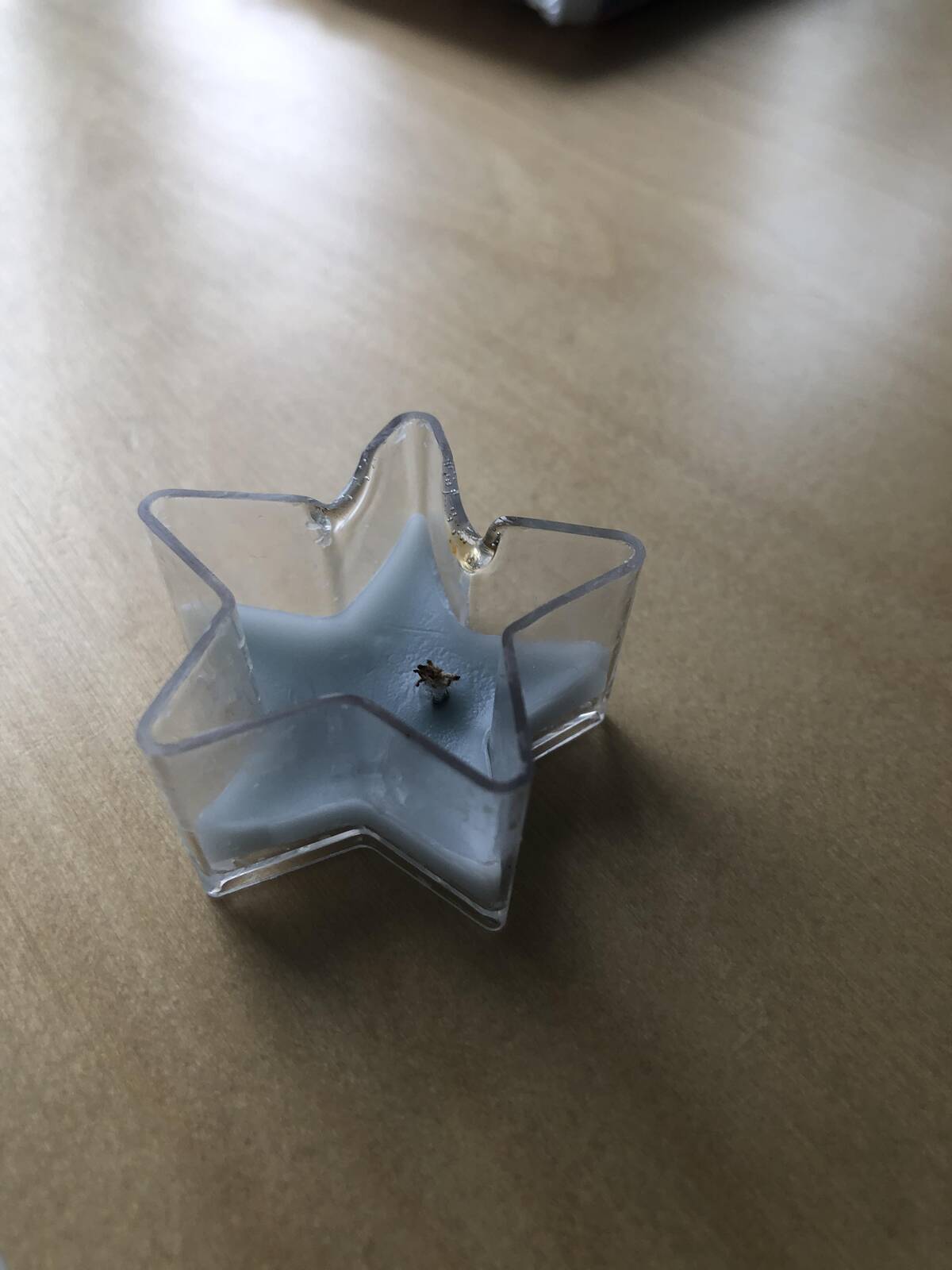
This candle burned so bright it forgot about self-preservation. How do you make a product that self-destructs like this? The real surprise isn’t the scent or even the ambiance—it’s whether or not your table will stay safe. A star-shaped candle, destined to live fast and die melty.


