
10+ Failed designs no one wanted or needed
Trending Now
Ever feel like something just isn’t quite right with the way things look or work? Get ready for a whirlwind tour of some of the funniest, quirkiest, and most questionable design moments captured in daily life. You might walk away questioning every light switch, elevator button, or sign you see!
“Club World Cup final poster”
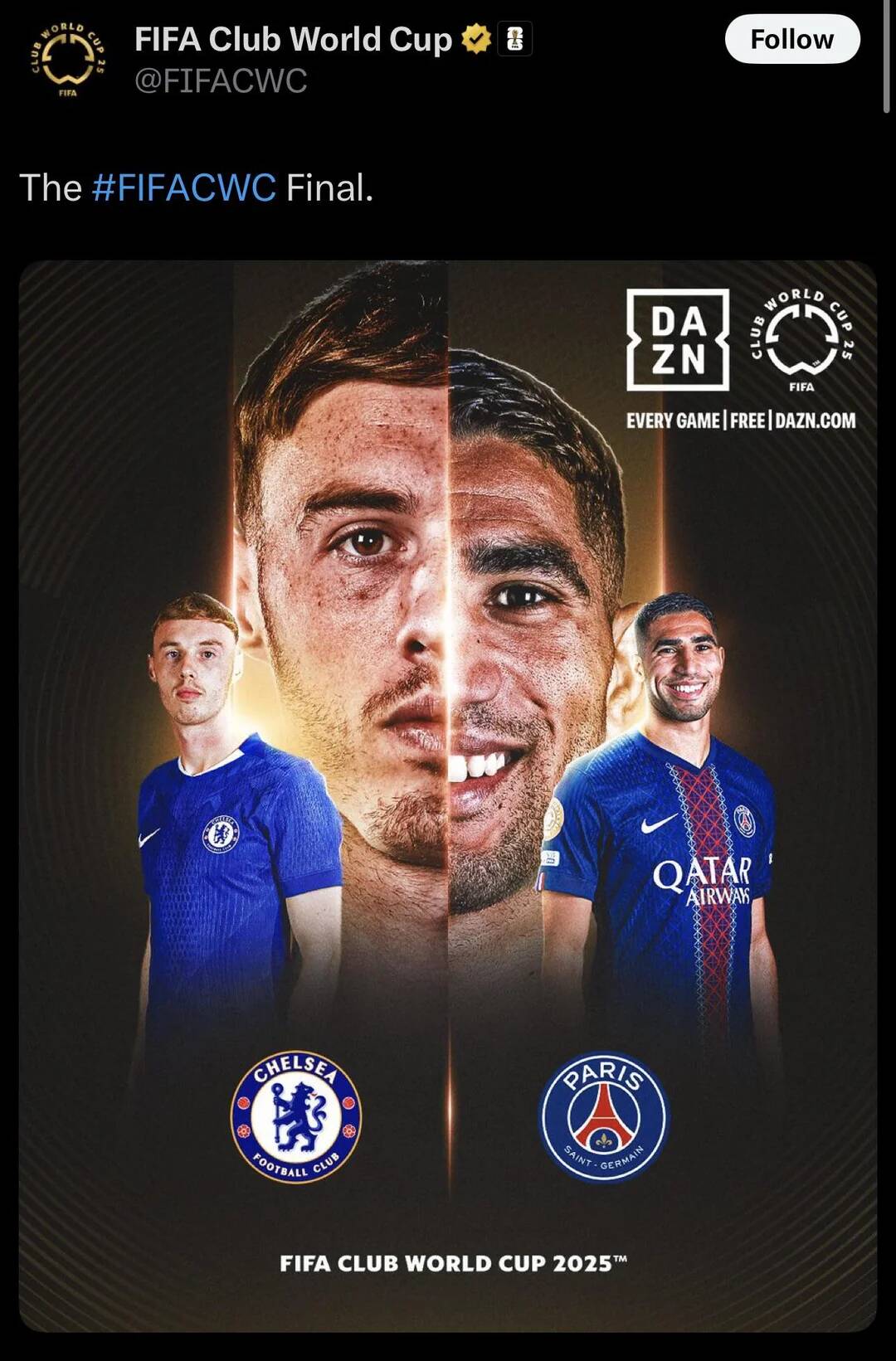
Why do these faces look like a FIFA photoshop experiment gone wrong? The poster is clearly hyped, but all I can focus on is this bizarre face-mash. Is this a final or a failed before-and-after ad campaign? Two teams, one identity crisis—inspiring both football and graphical confusion.
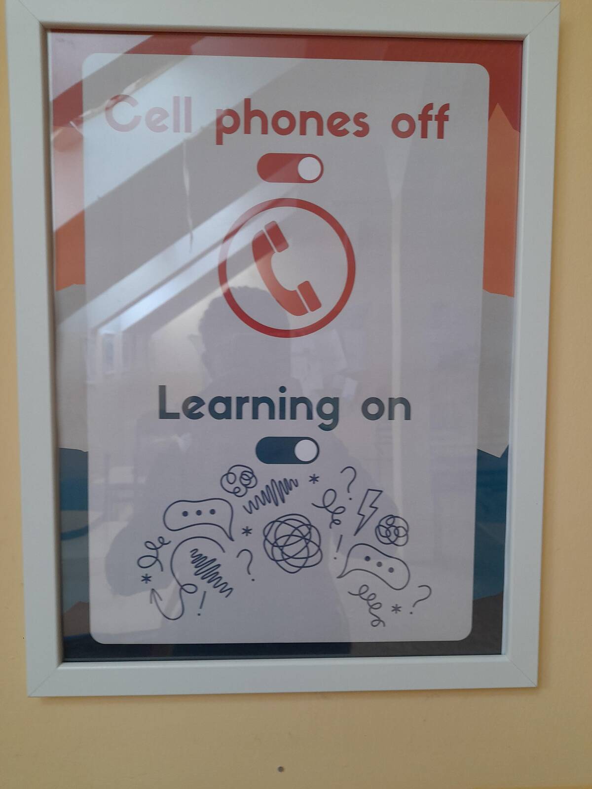
“It Took Me a Year to Find the Switch For My Bathroom Fan.”
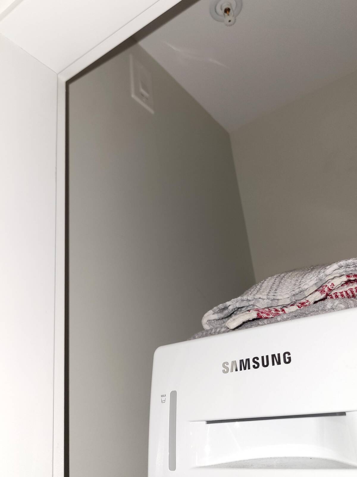
I love a good game of hide-and-seek, but I didn’t realize my bathroom fan switch would be the winner. A whole year to find it? That’s just cruel design! Was it meant to be a secret, or was the architect just out of ideas for switch placement? Plot twist: It was hiding in plain sight.
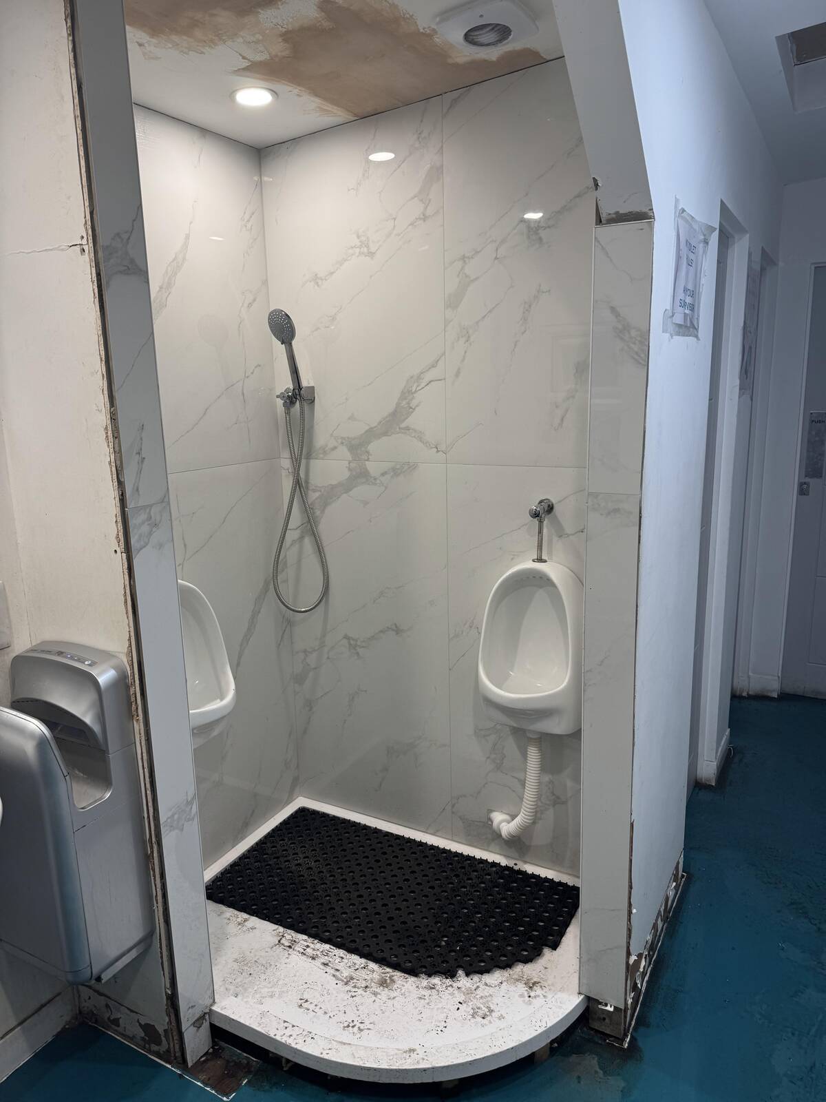
“Hideaway bathroom behind stairwell”
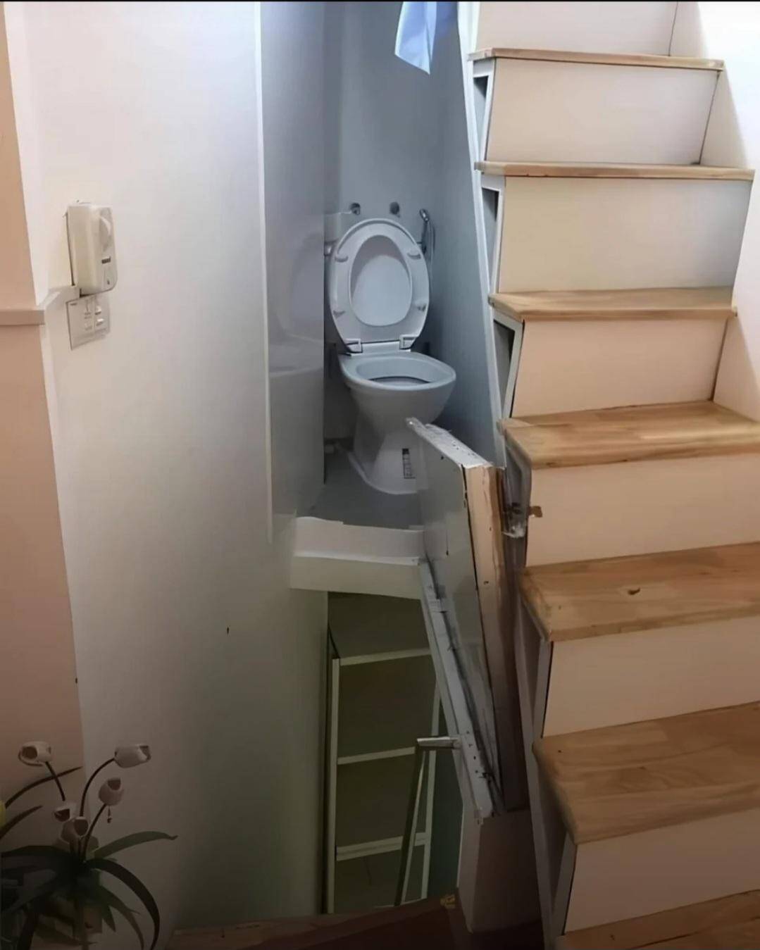
Who needs privacy when you can have a bathroom crammed behind a stairwell? The only thing missing here is a sign saying ‘Daredevils Only.’ Guess if you’re using this, you’re at least safe from surprise visitors… unless they’re running down the stairs.
“ATM in the wall AND window of a 1690 building”
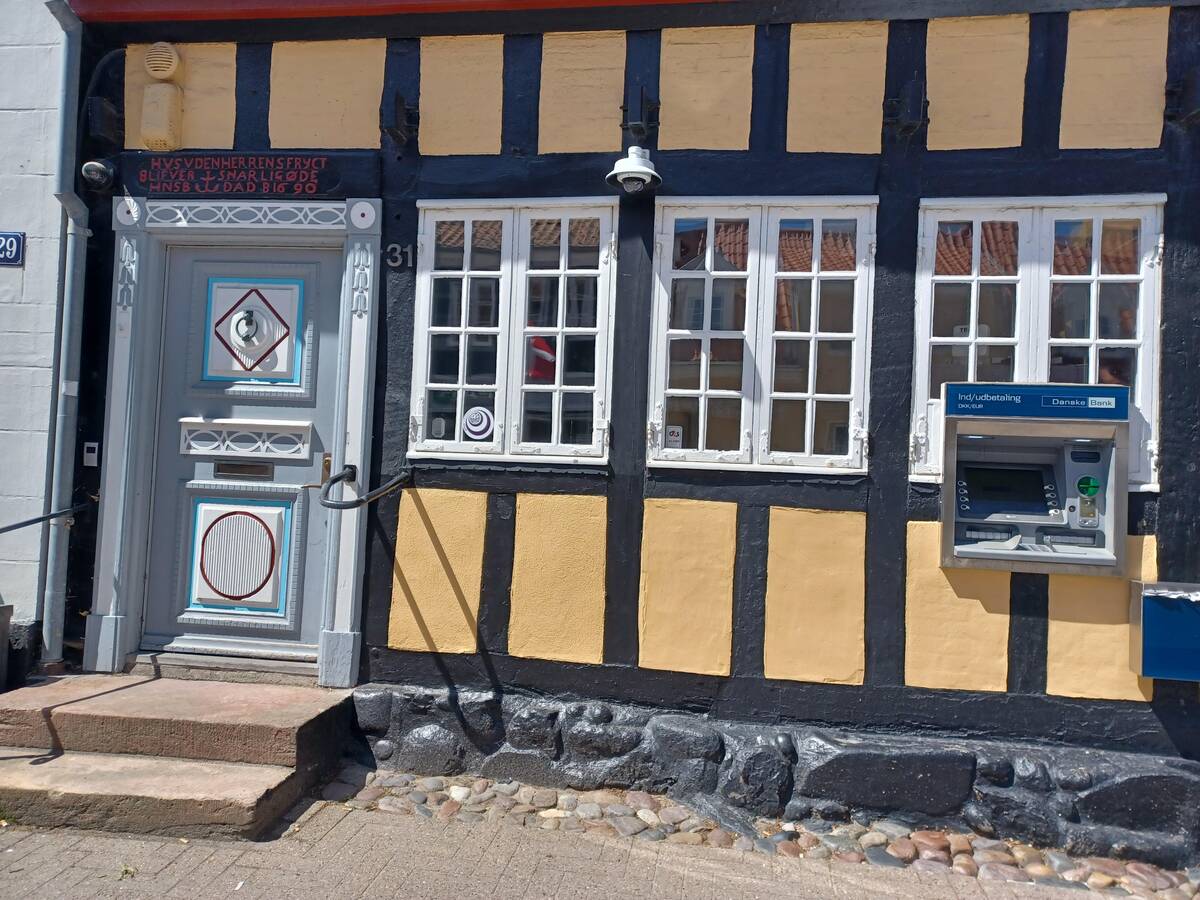
An ATM installed into the wall—and the window—of a 17th-century building shouldn’t make me laugh so hard. Historic charm meets banking necessity with brute force. I adore the commitment to convenience, but surely there was a less invasive way to bring modern finance to a classic facade?
“This elevator panel is completely unreadable in sunlight. If you look closely you’ll see “1” in blue colour and “G” in red”
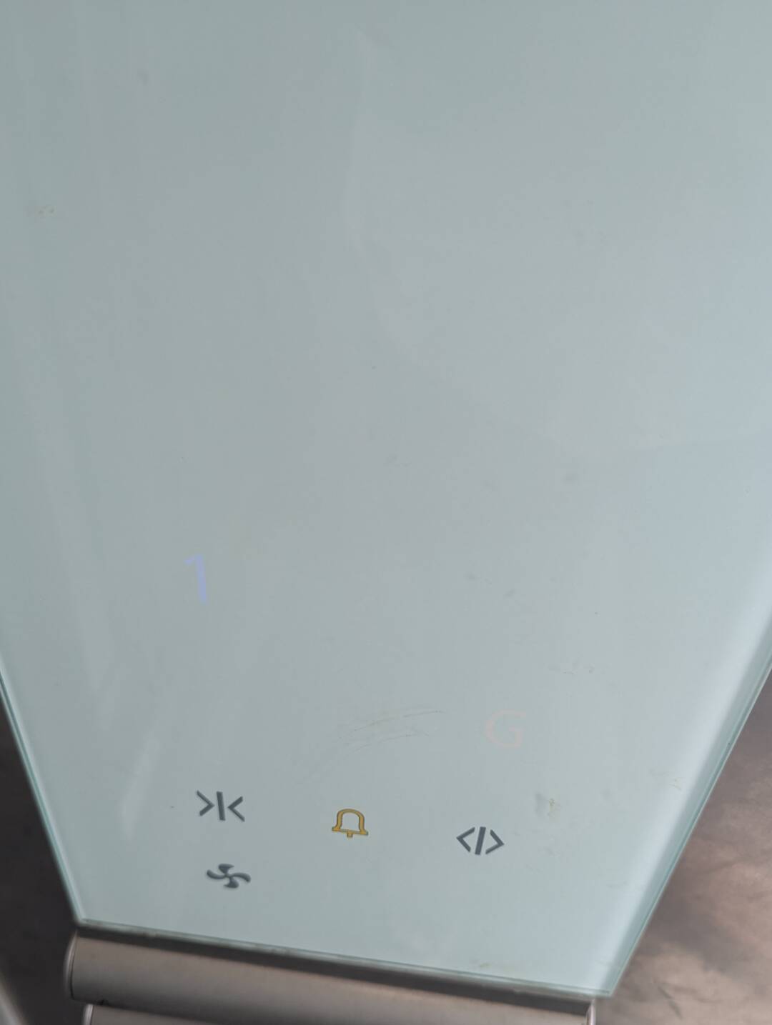
Sunlight: 1, Elevator panel: 0. Trying to figure out what floor you’re on should not require squinting and detective work! Seriously, who decided on blue and red for barely-visible digits? I guess the adventure starts before you even get in the elevator.
“Do you want a zero protein diet? Look no further.”
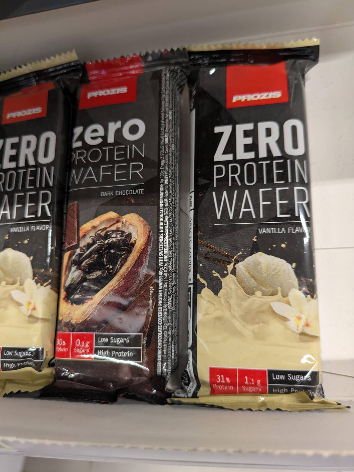
Zero protein wafer? For those people who crave the taste of nothing but disappointment. Wait, the tiny text says high protein, but the boldest words say ‘zero protein.’ Did I just unlock snack paradox?
“Ĥäppĩñęśś ĩś crappy graphic design”
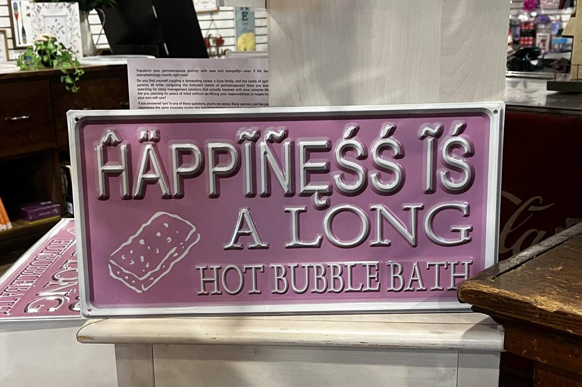
They say happiness is in the little things, but I’m pretty sure it’s not in this font. Those flourishes and accents are actively fighting me. It’s less a cheerful reminder and more a cryptic puzzle. My eyes are not happy. Graphic design—maybe not happiness—in action.
“If only Louisiana looked like a letter of the alphabet.”
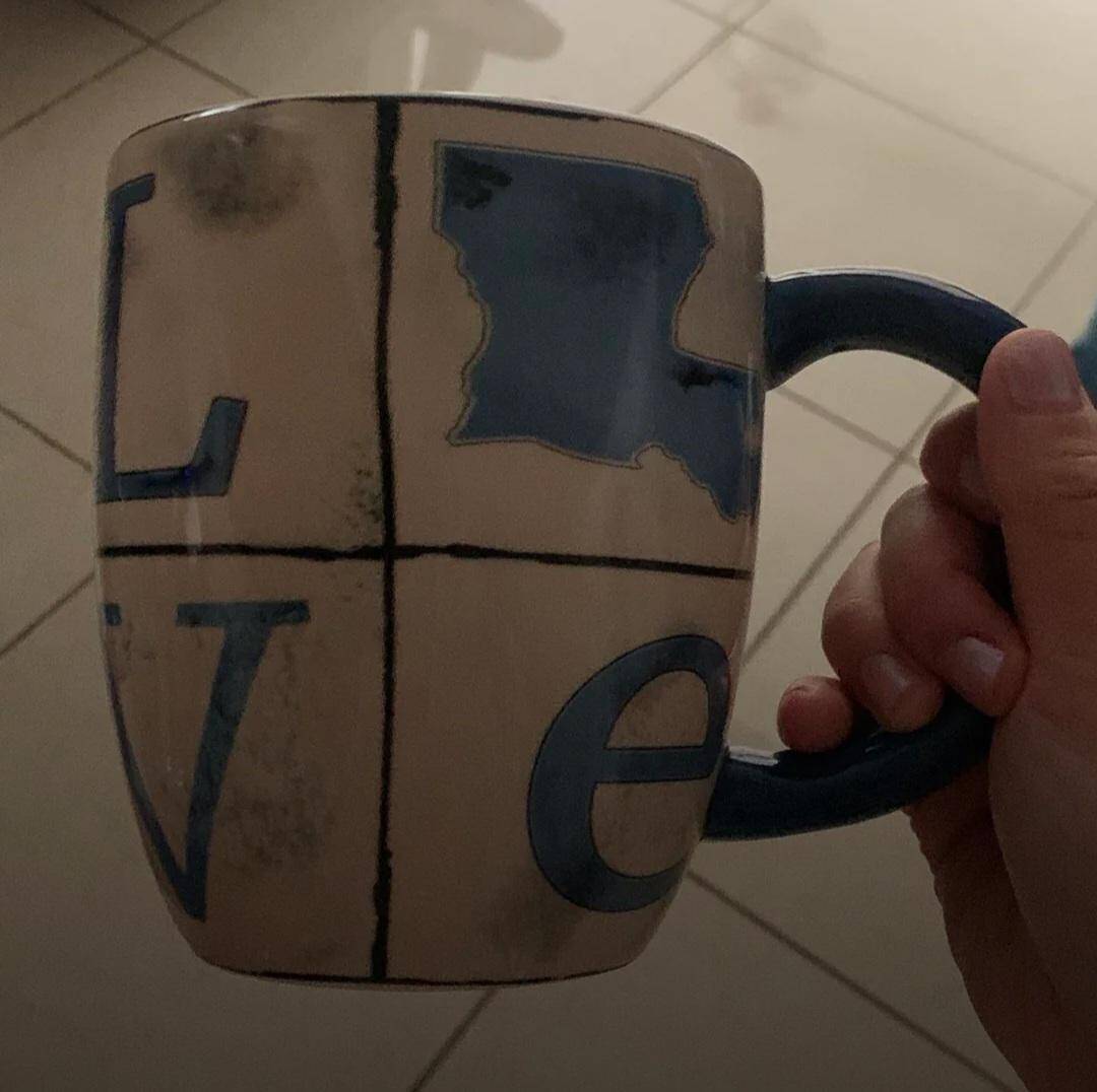
If only Louisiana looked like a letter, they said. Well, here’s a mug that took that suggestion way too literally. Spoiler: It’s supposed to be an ‘O,’ but now I can’t unsee the state. Drinking from this must be a geography lesson in confusion.
“The switches don’t really match up”
There’s nothing quite like playing Russian roulette with light switches that don’t match up. Every flip is a surprise! Just the thing you want when entering a dark room—trial and error meets modern wiring mystery.
“A combination no one has ever wanted. So awful I had to make my first post.”
Yikes! Whatever these two foods are, I’d truly never imagine (or want) them together—and I can’t look away. Is this an accidental culinary crime? This combination screams “bad idea.” When even the photo says ‘first-time poster,’ you know it’s not a flavor worth remembering.
“Completing the crappy set”
Is there such a thing as a matching set of bad ideas? Apparently so! The aesthetic here goes all-in on ‘confusing.’ It takes a certain commitment to double down when the first item went so wrong. This is what completionism looks like for questionable design.


