There are ads that come and go, products that head the way of the dinosaur, and some of both that have flash-in-the-pan, Super Bowl success without any staying power.
Photo Credit: Instagram, @comicbook_ads
The logos in this list, though, don’t fall into any of those categories. They’re logos that are so engrained in the minds of Americans, so pervasive in pop culture, that you’d literally have be living off the grid not to recognize them and connect them to their products without even thinking twice…and yet, when asked to draw them from memory, only a small percentage of Americans could do so with a decent amount of accuracy.

Photo Credit: Pixabay
Lesson? Brains are weird, y’all.
Well, that or we’re living in a parallel universe, which seems to be increasingly possible…
#5. Burger King
Ah, the old words inside of a sandwich. Wait, that’s it, right?
If you can’t remember off the top of your head, don’t worry – neither could 80% of your American compatriots. A large number of folks tried to incorporate the crown they probably coveted as children into the official logo, but mostly people left out one thing or another.
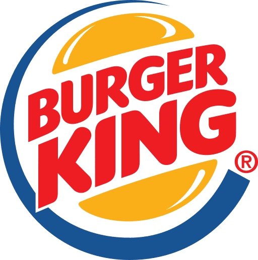
Photo Credit: Wikipedia
Hey, it’s sort of complicated, and that blue crescent? What is that even doing there!
#4. Walmart
Love them or hate them, with very few exceptions, Walmart is a staple of American life. Their logo is simple – just their name and a sunburst – but that didn’t make much of a difference. 68% of people did recall the sunburst, but not where it was placed or how many rays protrude from it, and more than a few people seemed to have a hard time remembering that the store’s name is no longer hyphenated or separated by a space.

Photo Credit: Wikipedia
Only 12% drew it perfectly from memory.
#3. Apple
You would think that, with the proliferation of Apple devices (very few people have never held one by this point in time, I would guess) that people would be able to recall what it looks like from memory.
You would be wrong.
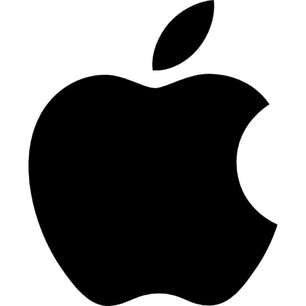
Photo Credit: Wikipedia
Only 20% of people were able to draw it almost perfectly from memory, with the majority making it: the wrong color, with a stem, with the bite out of the wrong side (or no bite at all) or, oddly, resembling PacMan.
#2. Starbucks
I mean, come on. Starbucks is one of the fastest growing, proliferate cafes on the planet. You’ve been inside one, even if you don’t drink coffee. If you want to dispute that, fine, but I know you’ve walked or driven by at least one on a near daily basis (if you live in a city) or seen them a hundred times on television shows and in movies if you don’t.
Photo Credit: Fox
It’s a hard logo, though. I have no artistic talent so I would have effed it up, for sure, even though I technically know what it looks like.
Though the majority of people (90%) included the famous mermaid, most forgot details like her twin tails, her crown, or the star in the center of it.
Photo Credit: Wikipedia
#1. 7-Eleven
That people got this wrong so often probably surprised me the most. I mean, it’s pretty simple, and also the design is largely just the name incorporated into an image.
And yet, a lot of people – 81% – couldn’t get it right. A big chunk of those (46%) got it close to right, but a surprising number of people used numerals for the eleven instead of writing out the word.
Photo Credit: Wikipedia
All of which is even more interesting when you consider that the logo has only changed very slightly (the top of the seven going from red to orange) since the company’s inception in 1946.
Intrigued? Here are a few others that people were asked to recall blindly: Adidas, Domino’s, Foot Locker, Target, and IKEA. Take a shot at drawing them yourself before clicking on the link below to see how close you’ve gotten!
h/t: Signs.com
Check out these articles from Did You Know!
https://didyouknowfacts.com/real-people-behind-brand-product-names/
https://didyouknowfacts.com/successful-creatives-get-real-sharing-wish-tell-younger-selves/


