Trending Now
I think the reason – or at least, one of the reasons – that infographics have become so popular and fun is that in our world of “do everything faster” and “show me everything at once,” they’re the perfect visual capsule.
They give us a bunch of information on a single topic, usually with a graph or other appealing colors to make it visually interesting, and we feel as if we’ve learned something interesting or really useful in the time it takes to study an image.
It’s a win for everyone, and these 8 infographics will only make you love them more.
8. A guide to proofreader’s marks.
If you work in any kind of medium where your writing is edited, this is going to get tacked up on your wall.

Image Credit: Ebaum’s World
7. How many hours famous composers put in.
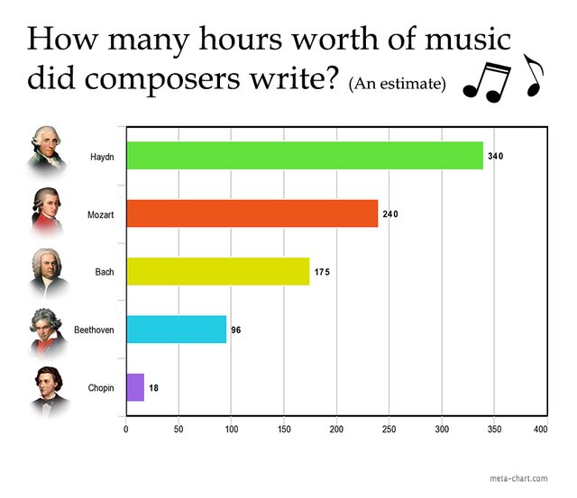
Image Credit: Ebaum’s World
Are you a music buff? You’re going to love this visualization of how many hours they each put in over the duration of their composing careers.
6. Sushi and Sashimi orders.
Many more people are coming into the world of eating sushi, but the menus can be intimidating – or at least they could, before this!
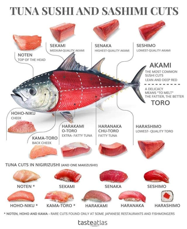
Image Credit: Ebaum’s World
5. If you struggle with anxiety…
This is a chart full of helpful tips on how to manage those attacks that come out of nowhere.

Image Credit: Ebaum’s World
4. How much it costs to propose at a baseball game.
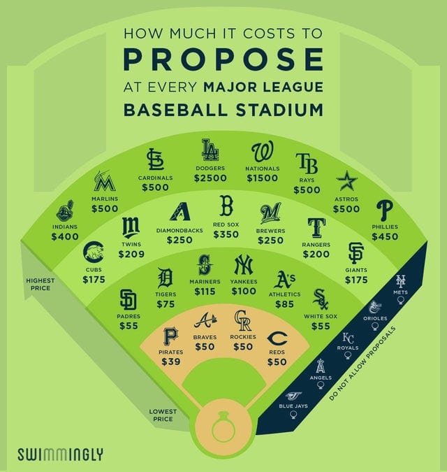
Image Credit: Ebaum’s World
Did you know it wasn’t free?
It’s not, and if you’re looking to pop the question to a baseball-loving partner, maybe you want to choose the cheapest option available.
3. Common clothing color combinations.
Are you fashion-challenged? If picking clothes and dressing yourself isn’t your bag, let this infographic get you an easy way forward.
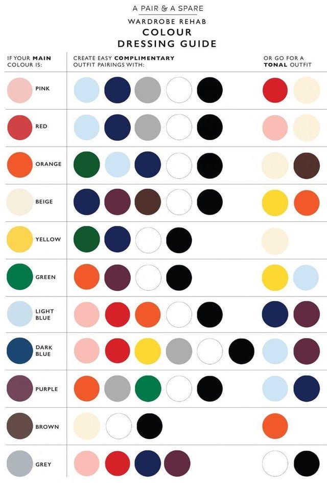
Image Credit: Ebaum’s World
2. If you want to avoid Nestle…
Their human rights abuses are an issue for many people, so here’s how to avoid supporting them, even when you travel.

Image Credit: Ebaum’s World
1. Jelly or jam?
Never get confused when you’re negotiating at the Amish store ever again!
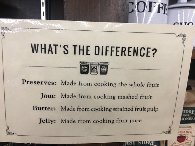
Image Credit: Ebaum’s World
I could honestly scroll through these all day.
What’s your favorite infographic ever? Drop the link in the comments!

