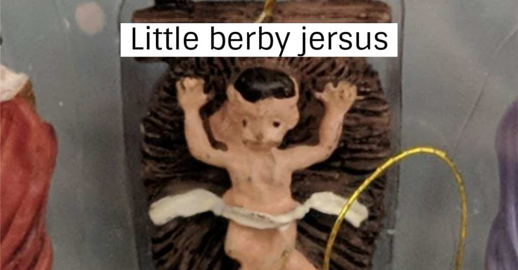
There are no stupid ideas…
…when you’re brainstorming. When it’s time to put plans into action, some plans are certainly better than others.
These 13 comical design failures probably never should have made it past the brainstorming phase.
1. Banana sheath:
Keeps the germs off. Unfortunately, they still bruise.
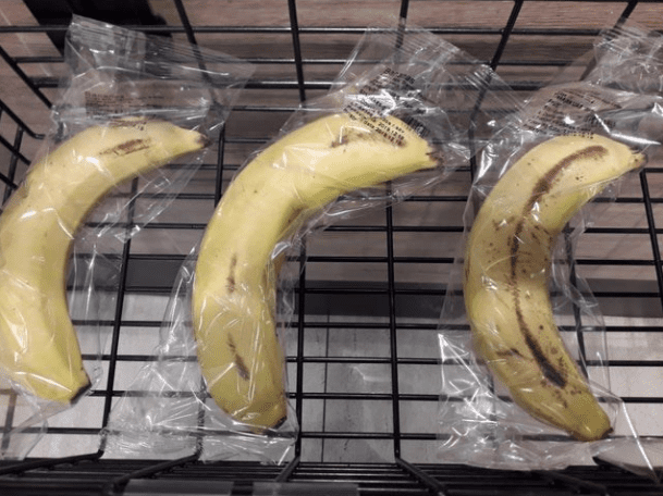
Image Credit: KoldunMaster
2. *sigh* It could have been so good:
It was so close.
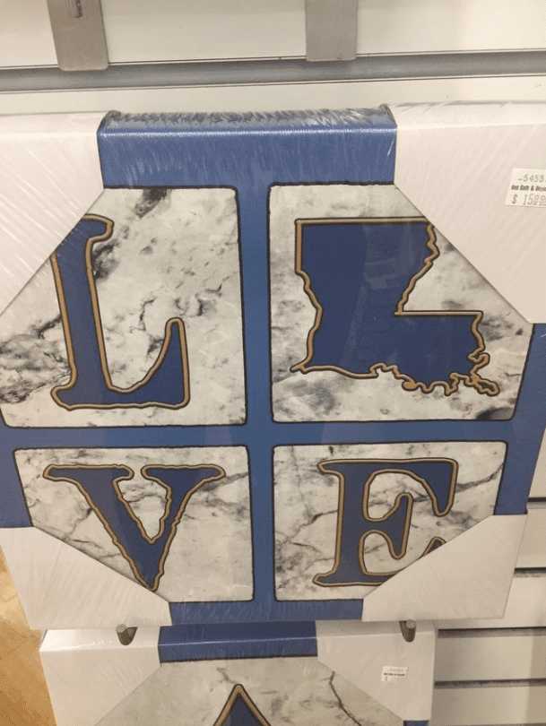
Image Credit: BeerandGuns
3. Jesus Christ:
Did someone leave him out in the sun too long?

Image Credit: ForlornBread
4. “C” is for cop out:
Shouldn’t we be teaching kids words that START with the letter X, in this situation?

Image Credit: AppleTruckBeep
5. Wait, what?
I…I’m confused.

Image Credit: memequeenbitch
6. Yikes:
Someone didn’t think this through.
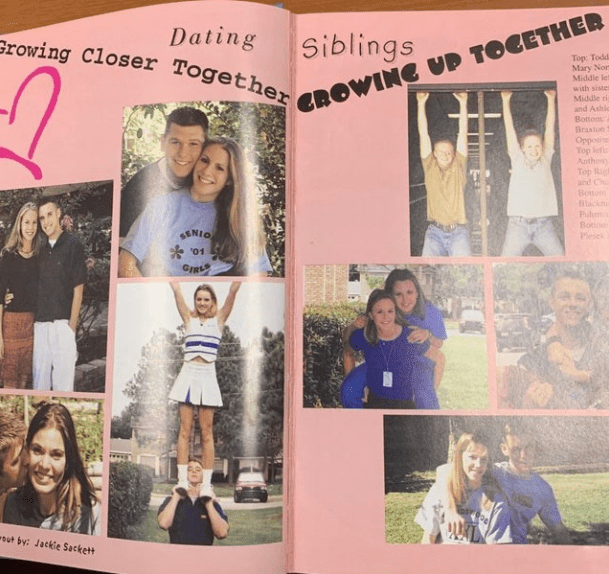
Image Credit: Cheezburger
7. Awwww:
Close but no cigar.
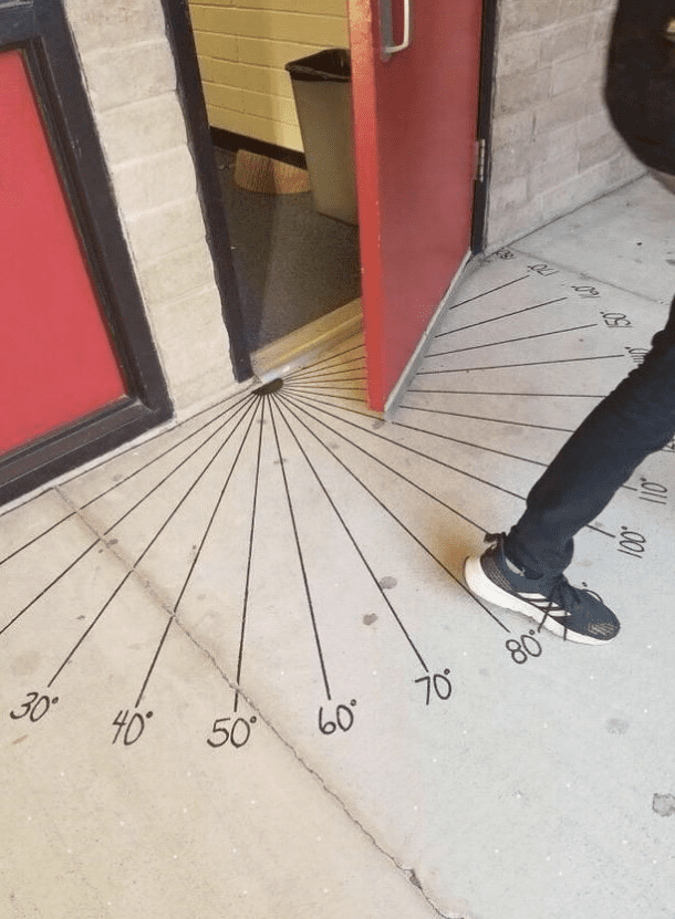
Image Credit: TheOx11
8. Um:
I honestly don’t know what to say to this one.

Image Credit: CptTrimBeard
9. Do nut apply here:
Unless you’re interested in taking over for whoever made this sign.

Image Credit: Pircay
10. Thank you?
Very helpful.
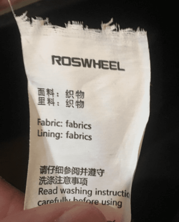
Image Credit: A1958PlymouthFury
11. This is just cruel:
What ARE we allowed to do here?

Image Credit: Xx_BaconPlays_xX
12. Haha, his face looks like a butt:
A very merry butt-mas.
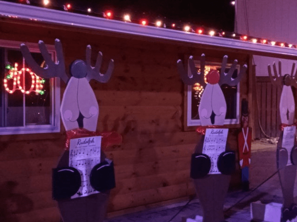
Image Credit: SomeDoge
13. What on Earth?!
Santa looks hungover AF…and why is she coming from between his legs?

Image Credit: howardkinsd
Seriously, what IS that thing? Who designed it? Who signed off on it? Who painted it? I need to know how this was allowed to happen.
Which design fail above is the absolute worst? Let us know in the comments.
Thanks, fam!

