Trending Now
You had one job!
How many times have you heard that yelled in your face before?
Or maybe in someone else’s face who you worked with?
The point is, a lot of people make big mistakes in the design field and some of them are just so good that they must be shared with the world.
Like these!
They’re really bad, but we think you’ll get a big laugh out of them! So enjoy!
1. Do you think they thought this one through?
I’m not so sure about that…

Photo Credit: Cheezburger
2. Soup for Sluts!
It sounds delicious!

Photo Credit: Cheezburger
3. Do these two billboards belong side-by-side?
Sending some mixed signals…

Photo Credit: Cheezburger
4. Take a closer look at the dress.
Come on, people…

Photo Credit: Cheezburger
5. SLIMING herb.
Sounds kind of…slimy…

Photo Credit: Cheezburger
6. Poor Granny…she never saw this coming.
I, for one, am quite offended by this.

Photo Credit: Cheezburger
7. Grandma really can’t catch a break.
They had to do it…

Photo Credit: Cheezburger
8. Kit Ka…
I would think you’d at least want the WHOLE name of your product on there, but what do I know?

Photo Credit: Cheezburger
9. Load up on lighter fluid kids!
Seems like a REALLY bad idea.

Photo Credit: Cheezburger
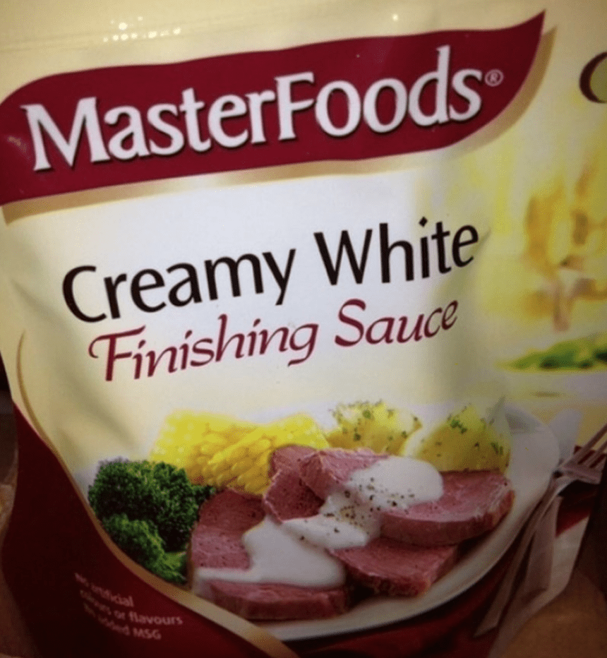
10. Just looks really disturbing.
Something to nibble on…

Photo Credit: Cheezburger
11. A watch! For the kids!
Just ignore the shape, I guess…

Photo Credit: Cheezburger
12. Perfect placement.
Do you think this is a big seller?

Photo Credit: Cheezburger
13. Yikes…let’s end on that note.
Not a good look…not good at all…

Photo Credit: Cheezburger
I hope these folks still have jobs…because those are some major FAILS!
Now we want to hear from all the readers out there.
Have you seen any really bad design fails lately?
If so, please share them with us in the comments. We’d love to see them!


