
Trending Now

I love a good map. It’s fun to visually see statistics or favorites or whatever else in map form, to check out your state see how it compares to others, no matter the random criteria,
You can make a map for just about anything, but honestly, they’re all cool and interesting to me!
These 20 maps run the gamut, from the most common language spoken (after English and Spanish) to the most common surname, and I had such a fun time scrolling through all of them – I hope you do, too!
20. The Use of the Word ‘Dang’ Across the U.S.
This is silly but I love it.
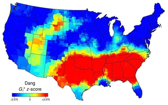
Image Credit: Reddit
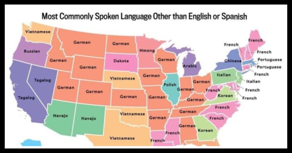
19. The Most Commonly Spoken Language Other Than English or Spanish
Way more German than I expected, guys!
Most commonly spoken language in the US after English and Spanish
byu/AlpineEsel inMapPorn
18. How Desirous Residents are of Moving.
I am lol-ing at the obviousness of Texas.
The U.S. mapped by residents’ desire to move to a different state.
byu/wibblesandbits inMapPorn
17. The Alaskan Perspective of the United States.
They are like, half as big as the mainland.
The United States of America: Alaskan perspective
byu/Pariahdog119 inMapPorn
16. Out of Service Railways.
How things have changed.

Image Credit: Andrew Grigg
15. How Brits see the United States.
They say they’re sorry, but are they REALLY?
How I, a Brit, see the United States (Sorry if it offends anyone)
byu/DavidMcFarlanee inMapPorn
14. The Loudest And Quietest Spots in the U.S.
This is relevant to my interests. Keeping for the next time I move.
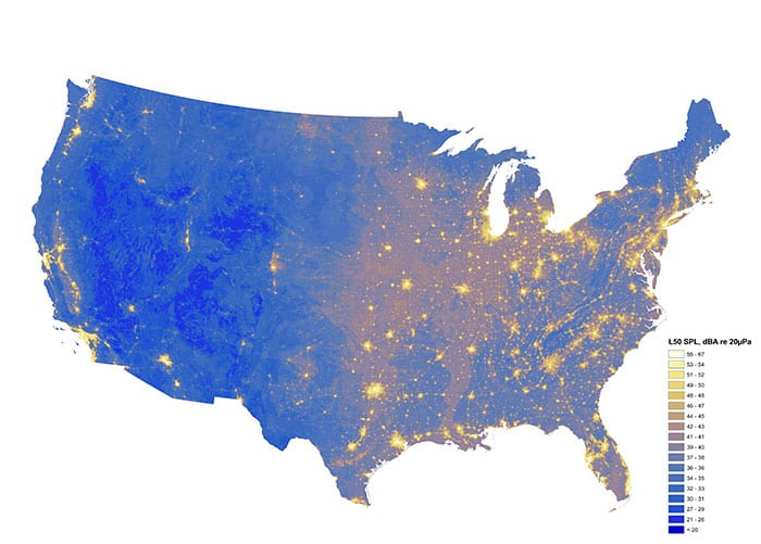
Image Credit: National Park Service
13. Entire States with a Smaller Population Than Los Angeles County.
I am completely stunned by this one.
States with a smaller population than Los Angeles County [960 x 606]
byu/SwiftOryx inMapPorn
12. The States Scaled Based on Population.
Not quite as tidy a map but.
US States scaled proportionally to population density [1159×1024]
byu/StarboardCapsized inMapPorn
11. Watersheds in the U.S.
Honestly just sharing because of how pretty it is.
10. The Increase of Drug Overdose Deaths in 15 Years.
A depressing, if interesting, visual.
Drug overdose deaths in the United States per 100,000 persons for 1999 and 2014 [1950×702]
byu/redleaderryan inMapPorn
9. Coastal vs Interior Populations.
I’m not shocked but the visual is still arresting.
Red and Orange Areas have Equal Populations
byu/Cogo5646 inMapPorn
8. More People Live in the Red Areas than the Grey.
Also known as an argument for getting rid of the electoral college.
More people live inside the red area than the grey area
byu/lex52485 inMapPorn
7. United States Population Lines.
This is super cool to look at – I love it!
6. Most Common Non-American Country of Birth (Excluding Mexico).
I thought this would be more varied, too!
I don’t know if has already been posted over here. But its very interesting.
byu/Farhan_Hyder inMapPorn
5. A Map of the Most Efficient Route Between All of the Springfields in the United States.
I had no idea there were so many of them.
The most efficient route between every Springfield in the United States
byu/GreenMobius inMapPorn
4. Every State’s Least Favorite State.
My favorite part is how even Florida hates Florida.
3. Tree Cover Map.
I honestly thought there would be more in the middle.
2. Most Common Surname.
I thought there would be more variety, how about you?
Most common surname in the United States by state [OC]
byu/some_dawid_guy inMapPorn
1. How Much Snow Does it Take to Cancel Schools.
One for the kiddos.
How much snow does it usually take to cancel schools?
byu/etymologynerd inMapPorn
I can’t decide which of these was the most interesting, or the most surprising!
Tell me what you thought in the comments!


