
Trending Now

On my many road trips, one of the most welcome sights are those golden arches. I know what to expect; I can grab a Diet Coke, and take a much-needed break.
And, like most company logos, there’s a reason behind the distinctive McDonald’s logo design and colors.
The story has its roots in the history of the fast-food chain. It started as a drive-in restaurant in Monrovia, then was relocated to San Bernardino in 1948 and named “McDonald’s.” One of the first things they did when they move was hire an architect named Stanley Clark Meston to design the building – he was the one who added the iconic arches that were later incorporated into the logo.
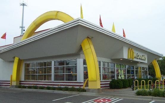
Photo credit: Wikimedia Commons
Even more instrumental in the growth of the McDonald’s brand and in its logo design was Ray Kroc. Kroc sold appliances to the first McDonald’s restaurant, and he was impressed with their speedy service and low prices. Kroc joined the company, developed a franchise program and launched the McDonald’s Corporation.
He later bought the whole company for $2.7, in 1961.
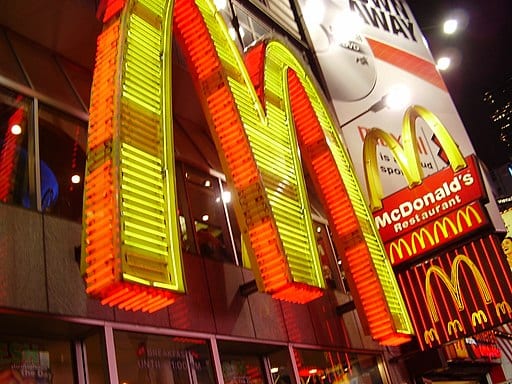
The original McDonald’s logo was a winking chef – cute, but not particularly memorable. Eventually, Kroc, along with Jim Schindler and Fred Turner, redesigned the logo to incorporate the arches from the original building. The new logo had two arches that overlapped and an arrow running through it. The design was yellow, outlined in red. The logo has been redesigned over the years, but still retains the yellow arches, often on a red background.

Photo credit: Wikimedia Commons
The color choices were no accident. Red is known to stimulate appetite, while yellow is attention-grabbing and associated with happiness. Yellow is also easy to see, making it highly visible and appealing to passersby.
So when you feel mysteriously drawn to McDonald’s, the logo may be part of the reason why.
And french fries.


