
Trending Now

Sometimes, something is so bad, it’s good.
And sometimes, it’s just…so, so bad.
These 12 design fails could go either way. Poorly worded signs and incomprehensible designs, or laughable typos and innovative infrastructure?
We’ll let you be the judge.
1. “Don’t…you…so…”
“Live in your thoughts?” What IS this?
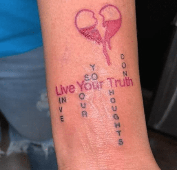
Image Credit: Mer-eye-yah
2. Re-designing human hands now, are we?
This is scary. Like, really scary.

Image Credit: V1CT0R_PR0
3. My question is: what does this actually say?
I have to peel? I have to peer?
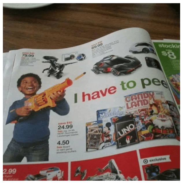
Image Credit: FaxedForward
4. V…I…thurp?
Wait, no, does it say “V, I thru up”?

Image Credit: Stealth2k
5. Whoop:
Now that, I would watch.
Image Credit: Momochichi
6. Junk in the trunk:
Why is his butt so big??
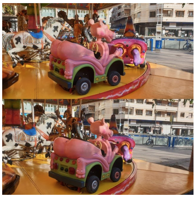
Image Credit: LittleRabbidFox
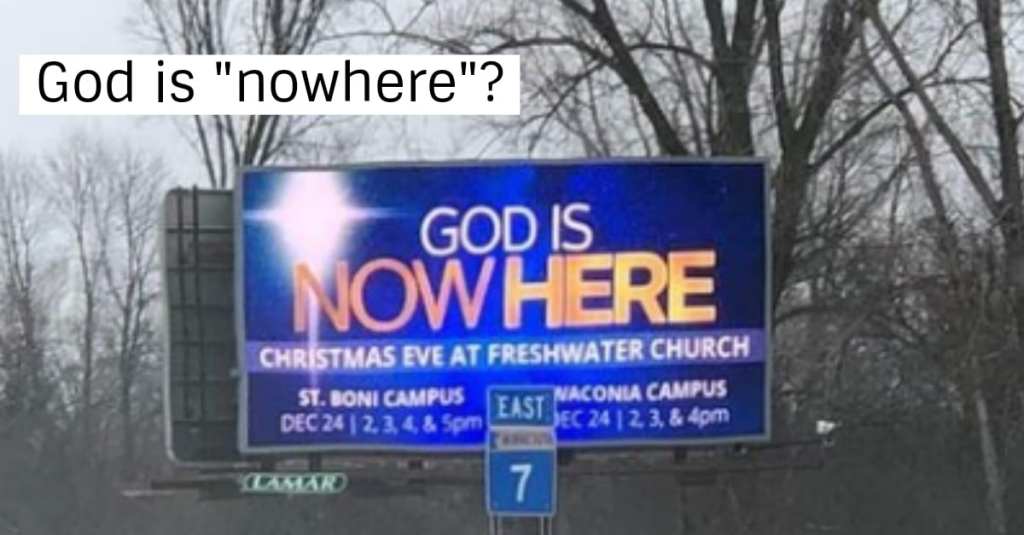
7. God is…nowhere?
Wow.
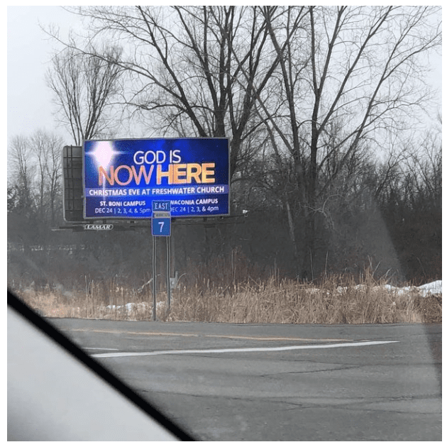
Image Credit: goodfootg
8. I don’t see the problem:
I quite like it, actually.
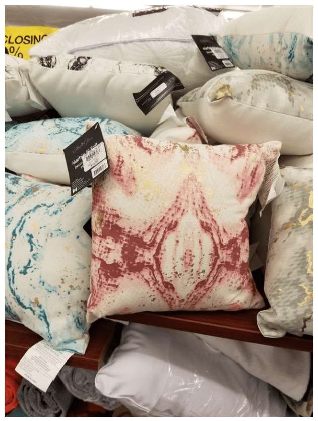
Image Credit: stereofeathers
9. Oooh nooo…
Good intentions…poor execution.
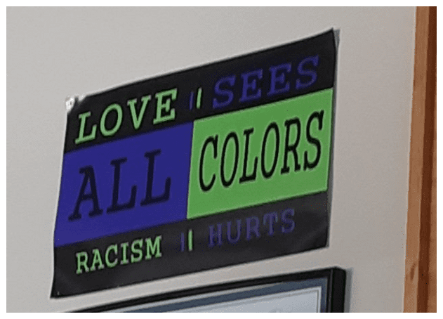
Image Credit: lachstar333
10. Something every family need:
Dear lord, some people just don’t think, do they?
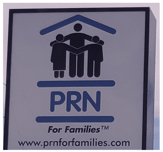
Image Credit: 7SurelyTemple7
11. Now that’s just pure laziness:
Someone got fired for this goof.
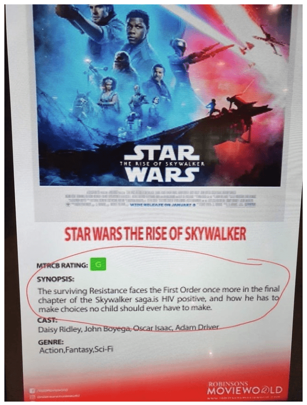
Image Credit: mrjake118
12. Putting the “U got to be kidding me” in “urinal”:
Where does it go?
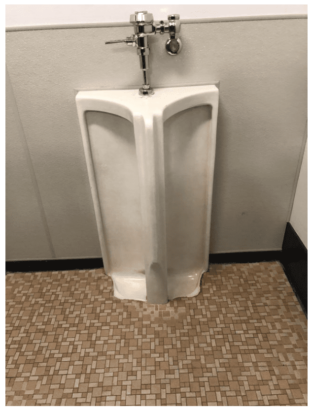
Image Credit: NBR360
Clearly, some mistakes were made.
Some “i”s weren’t dotted and some “t”s weren’t crossed.
Some poster designs were not given a second read before going to the printer.
But hey, that pillow though, am I right?
What do you think? Are these designs so bad, they’re good, or are they just bad? Let us know in the comments!


