

There are so many things we were taught in school that turned out to be flat wrong – and more things that, while technically correct, ended up not being the whole story.
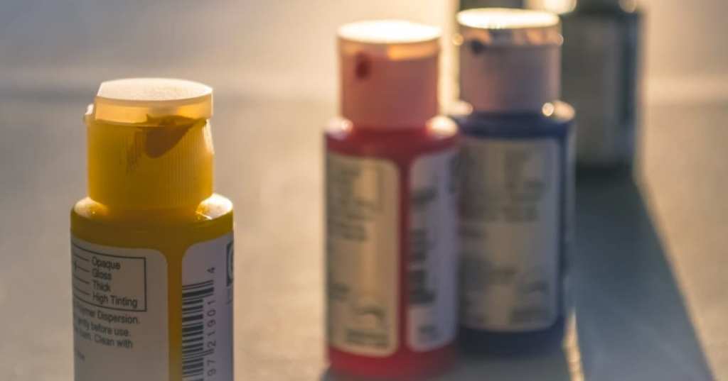
And if you spent an art class or several being told that the only primary colors were red, blue, and yellow, well…that’s not exactly correct.
Image Credit: Pexels
It is accurate if you’re painting, but if you’re talking about light, the primary colors there are red, green, and blue – so basically, you’re dealing with different color theories depending on the medium.
There’s a theory for material colors (additive) and a theory for colored light (subtractive). When we see things, we’re usually taking in a mixture of light and object,which means there’s color – and theory – mixing happening right before our eyes.
The Additive Color Theory

Image Credit: Pexels
Richard Raiselis, Associate Professor of Art at Boston University School of Visual Arts, says we can break down Newton’s theory of “primary colors” – those needed to create clear, white light, like this:
“Additive colors are those which make more light when they are mixed together. A simple way to think about additive light is to imagine three flashlights projecting individual circles of light onto a wall. The shared intersection of two flashlight circles is brighter than either of the circles, and the third flashlight circle intersection will be brighter still. With each mix, we add lightness, and therefore we call this mixture additive light.”
Now, imagine each of the three flashlights is a different transparent color – red, green, and blue.
“When the blue flashlight circle intersects the green one, there is a lighter blue-green shape,” he says. “It’s cyan. The red and blue mix is lighter too, a beautiful magenta. And the red and green also make a lighter color — and a surprise to nearly everyone who sees it – yellow! So red, green and blue are additive primaries because they can make all other colors, even yellow. When mixed together, red, green and blue lights make white light. Your computer screen and TV work this way. And if you’ve been onstage, you might have looked up behind the curtain to see the red, green and blue lights that serve as theatre’s additive primary colors.”
That doesn’t mean, though, that red, green, and blue are the only colors that will work – or even that they’re the most optimal.
“It is often mistakenly written that RGB are optimal because the visual system has receptors in the eye that respond optimally to red, green, and blue light but this is a misconception. The long-wavelength sensitive cone, for example, has peak sensitivity in the yellow-green part of the spectrum, not the red part.”
The Subtractive Color Theory
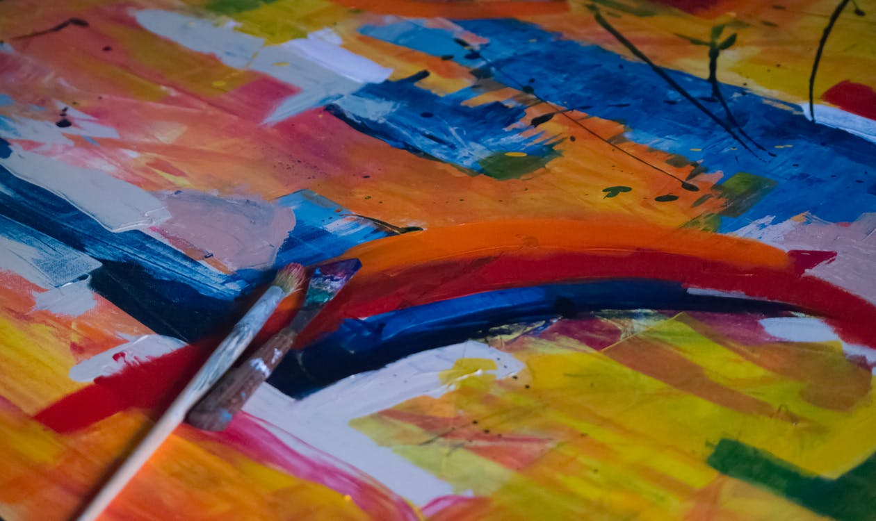
Image Credit: Pexels
Here, we listen to Stephen Westland, Professor of Colour Science at the University of Leeds in England.
“Subtractive colour mixing results when we mix together paints or inks. It relates to all of the colours we see of non-emissive objects, such as textiles, paints, plastics, inks, etc. These materials are seen because they reflect the incident light that falls upon them. Take a piece of white paper; this paper reflects all of the wavelengths in the visible spectrum to a very high degre. Now add a yellow ink on top of the paper. The yellow ink absorbs the blue wavelengths, leaving the others — which are seen as yellow — to be reflected. So rather than being additive, in this case we start with white (all the wavelengths being reflected) and then start to subtract light at certain wavelengths as we add the primaries.”
Basically, the chemical makeup on an object and how they reflect light determines which of the color systems comes into play, concludes Raiselis.
“Subtractive colors are those which reflect less light when they are mixed together. When artists’ paints are mixed together, some light is absorbed, making colors that are darker and duller than the parent colors. Painters’ subtractive primary colors are red, yellow, and blue. These three hues are called primary because they cannot be made with mixtures of other pigments.”
But, wait…red, green (or blue), and yellow aren’t even actually the best way to go.

Image Credit: Pixabay
Westland says instead that “cya, magenta, and yellow” are the best ones to use – and you only have to look to the printing companies of the world, who have already figured out that those three hues (along with black) are the best ways to create a large range of colors.
Mark Fairchild, professor and director of the Program of Color Science/Munsell Color Science Laboratory at Rochester Institute of Technology in New York, adds his two cents:
“The subtractive primaries are really cyan, magenta, and yellow. the names ‘blue’ for the ‘cyan’ and ‘red’ for the ‘magenta’ are typically misnomers. Other colors can be used as primaries, but they will not produce as wide a range of color mixtures.”
Why are the terms so inaccurate, though? Put simply – light, says Fairchild.
“The yellow primary controls the amount of blue light reaching our eyes. A small amount of yellow primary removes a small amount of blue light from the original white stimulus, while a larger amount of yellow removes more blue light. The magenta primary controls the amount of green light and, finally, the cyan primary controls the amount of red light. The subtractive primaries do this by absorbing different amounts of red, green and blue, while the additive primaries simply emit different amounts. It’s all about controlling the amounts of red, green and blue light.”
So if we’re not teaching students about the importance of primary colors, what should we be teaching?
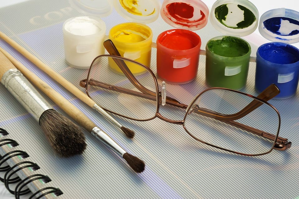
Image Credit: Pixabay
It turns out that Westland has some ideas.
“It turns out that RYB is in fact a particularly poor choice of subtractive primaries. Many of the mixtures that are produced are dull and desaturated and consequently, the gamut of colours you can produce will be small. What you should teach is that there is a clear relationship between the additive and subtractive colour primaries. The optimal additive primaries are RGB. The optimal subtractive primaries are cyan (which is red absorbing), magenta (which is green absorbing), and yellow (which is blue absorbing). Now, there is no conflict between the two systems and, in fact, it can be seen that additive and subtractive primaries are almost mirror images of each other. The best subtractive primaries are CMY because the best additive primaries are RGB.”
And get this – red and blue aren’t actually primary colors, because you can make them by mixing others together.
Image Credit: Pixabay
If you open an art program on your computer and make something red, then print it, your printer will make the red hue by mixing it’s magenta and yellow inks together,
As far as blue, well, Westland says it only “looks pure because it absorbs strongly in two thirds of the spectrum.It absorbs in the green and red parts. Red absorbs in the blue and green parts. If we mix them together, between them they are absorbing everywhere! The resultant mixture, although it may be a purple colour, will be dull and dark. The absorption spectra of these colours are too broad. It is better to use cyan than blue because cyan absorbs mainly in the red part of the spectrum; and magenta absorbs mainly in the green part of the spectrum. If we add magenta and cyan together we get absorbing in the red and green parts of the spectrum but we allow the blue light to be reflected.”
Here’s a handy breakdown he created:
B = M + C
G = C + Y
R = Y + M
Westland has a great video series on the topic, should you want more, and Fairchild also has a resource for kids (which honestly helped me make sense of all of this), too.
Basically, it’s time to unlearn what you were taught in school, because when it comes to the rainbow (of colors), the possibilities are just as endless as we’ve always dreamed.
As long as you don’t run out of cyan, magenta, or yellow, of course.


