

We live in incredibly frightening times, no doubt about that. Mass shootings in public places have become not a monthly event, not only a weekly event, but sometimes a daily event with shooters attacking in multiple cities on the same day. Sadly, we recently saw this phenomenon in El Paso, Texas, and Dayton, Ohio, where scores of innocent victims were mowed down within hours of each other.
The numbers are staggering. And the names associated with mass shootings are permanently burned into our brains. Newtown, Las Vegas, Columbine, Parkland, Pittsburgh, etc. The list goes on and on.
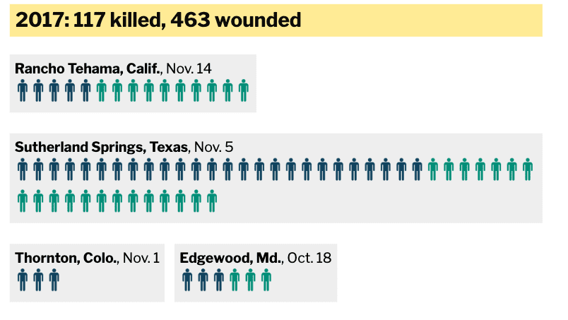
What are the answers? And why is this a uniquely American problem? Yes, these kinds of mass shootings do happen in other countries on occasion, but not nearly as often as they do in the United States. 2019 is not over yet and there have already been 57 people killed and 78 wounded this year. Compare that to 1982: 8 killed and 3 wounded.
A chart compiled by Mother Jones, shows how serious America’s mass shooting epidemic has become and how it has evolved since 1982. The chart specifically looks at incidents of gun violence in which a shooter attacked indiscriminately in a public place, killing 4 or more people. It does not include conventionally motivated crimes (ie, robbery or gang violence), even if over 4 people ended up being murdered.
Here is the sobering chart.
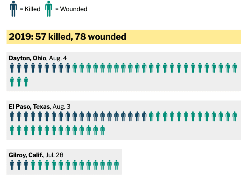
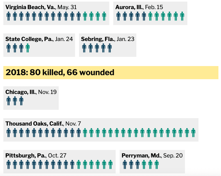
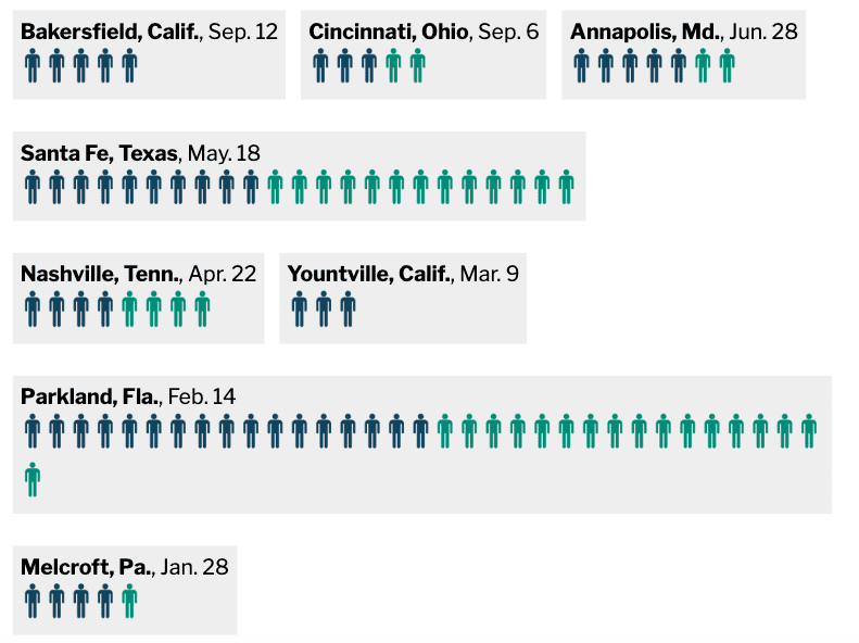
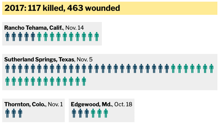
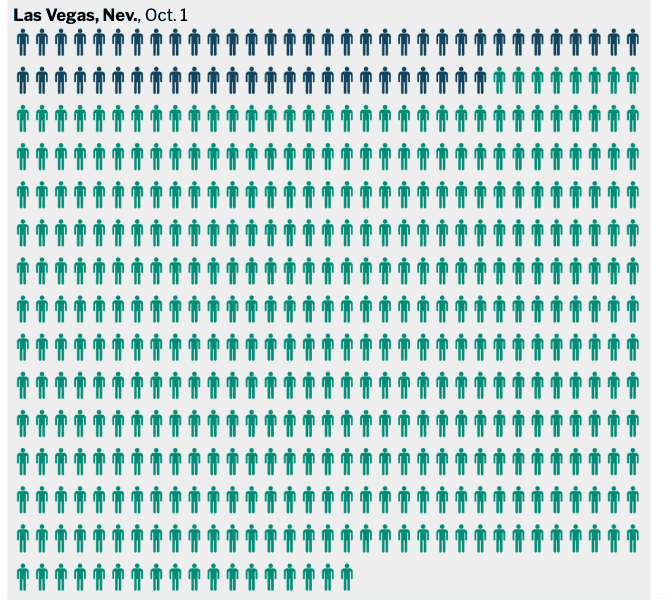
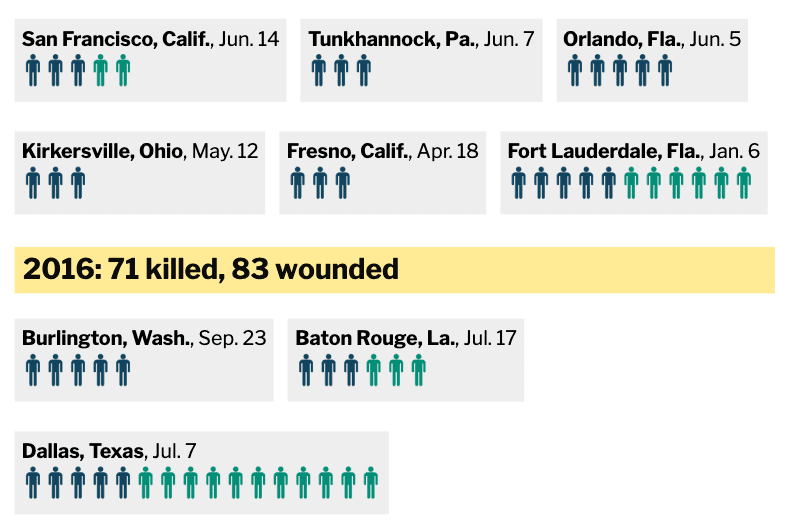
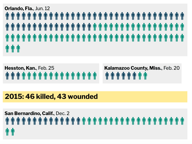
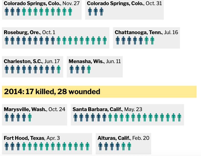
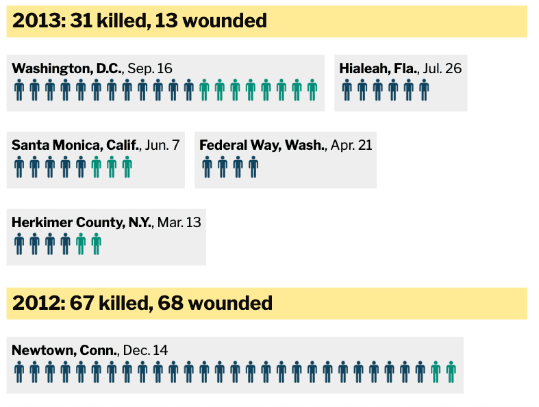
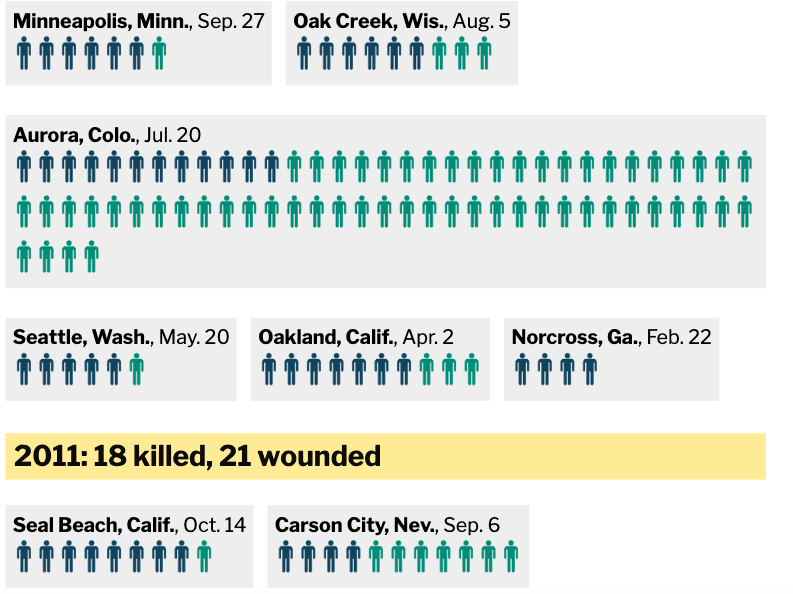
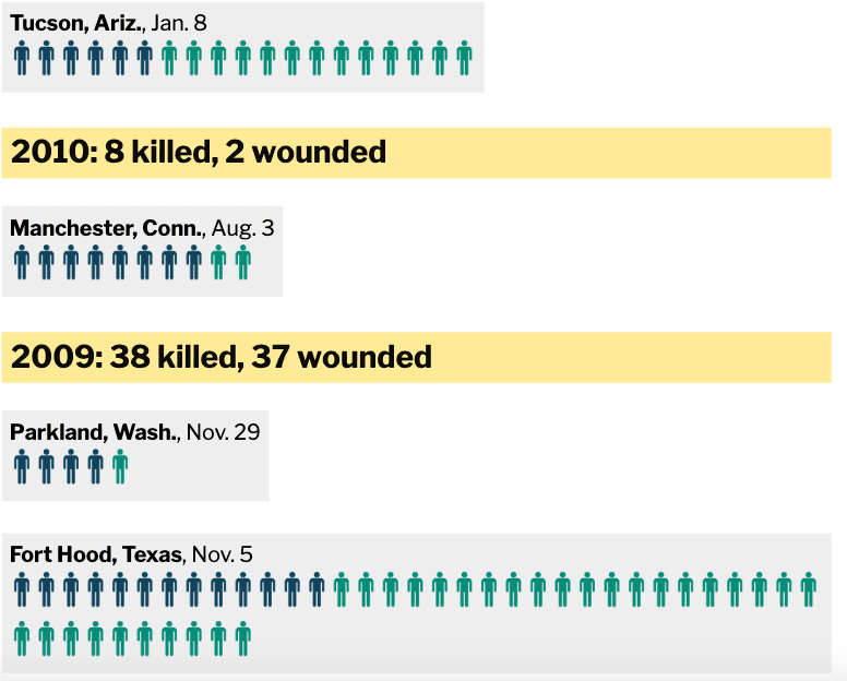
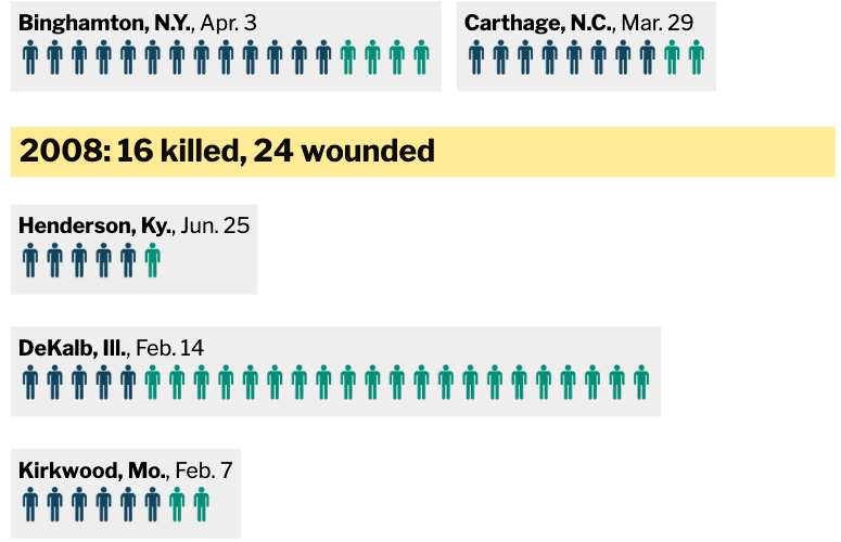
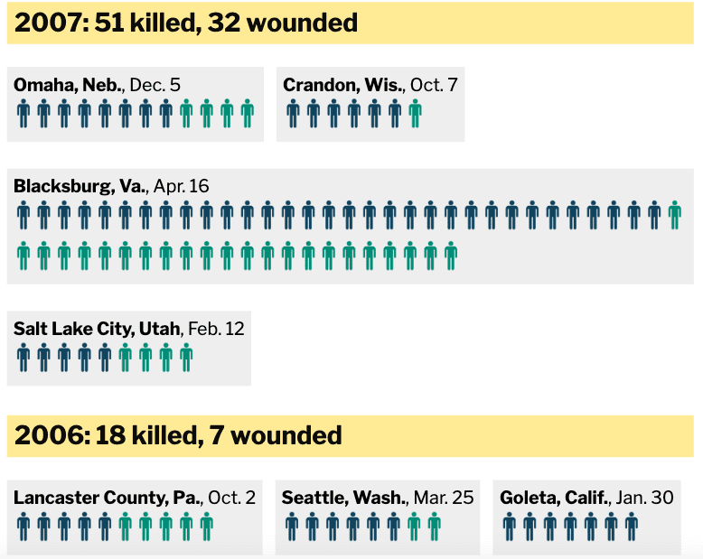
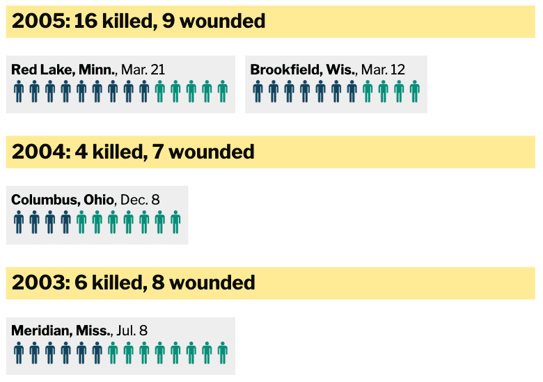
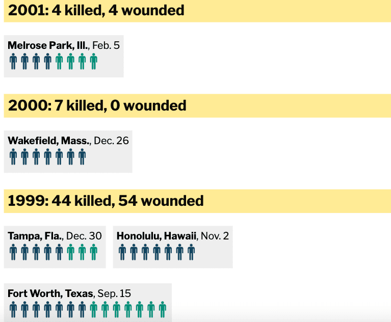
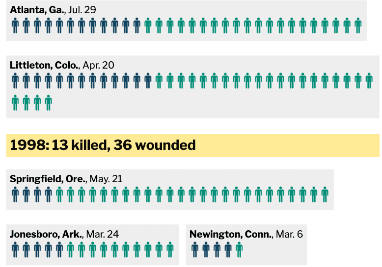
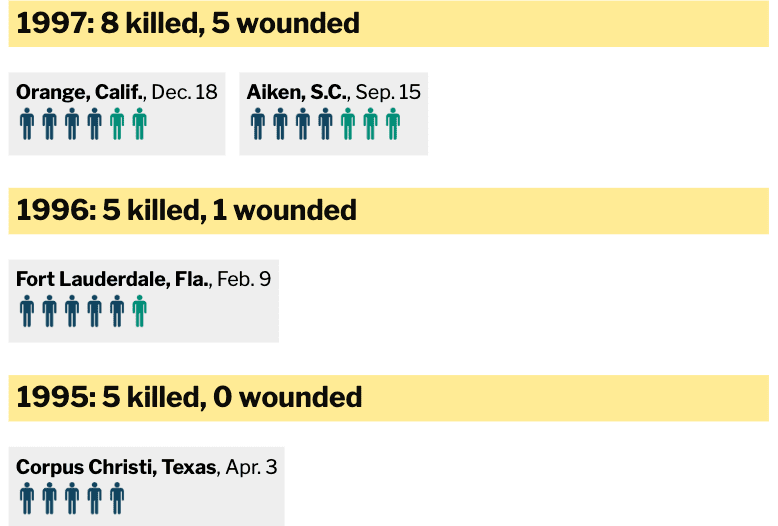
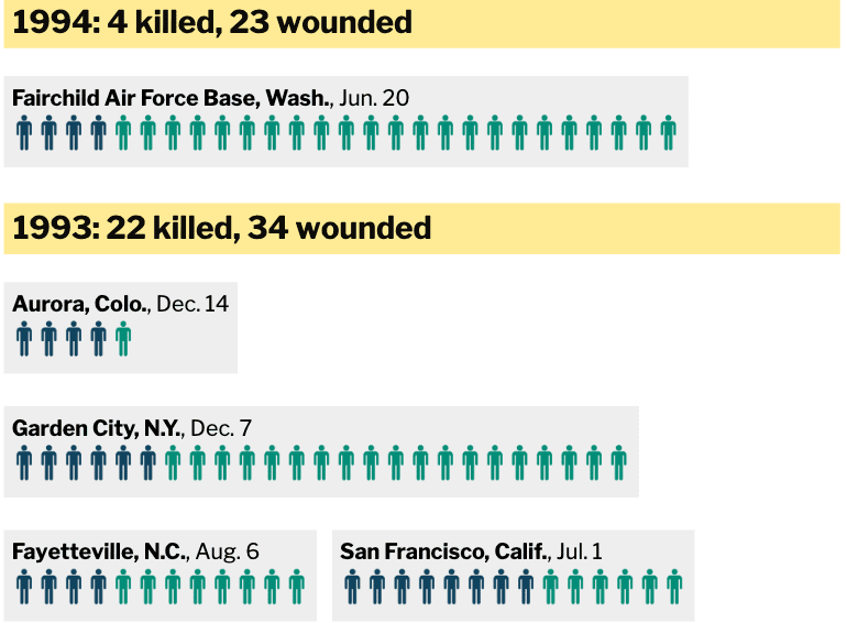
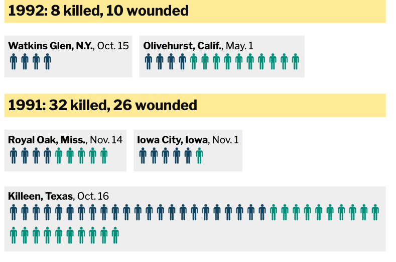
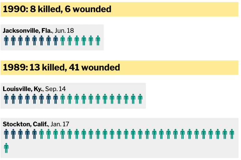
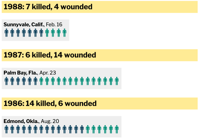
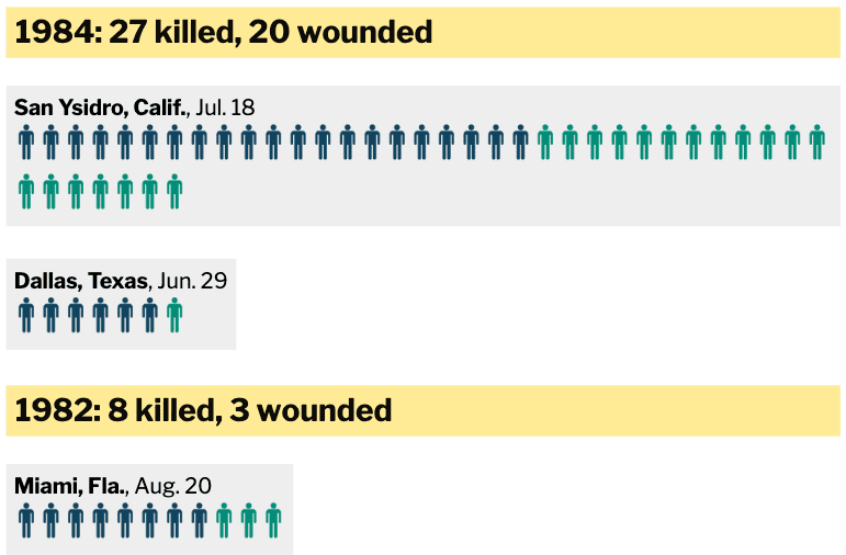
Photo Credit: Mother Jones
As you can see, in the last 37 years, 932 people have been killed and 1,406 others wounded in America in mass shootings. Those numbers are absolutely frightening.


