

You probably remember from history class that globes and atlases are a little skewed. Alaska, for example, is way bigger than it appears on the map. The same goes for Texas.
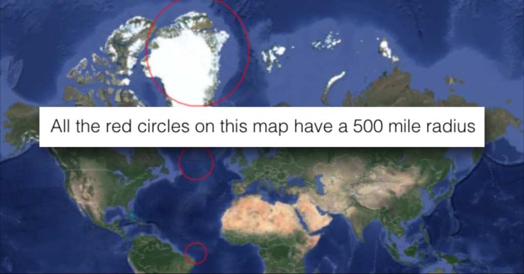
But here’s an image that will really blow your mind. All of the red circles on this map below contain a 500-mile radius, despite their vastly different sizes.
Just try to wrap your head around that!
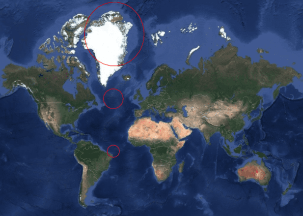
Photo Credit: Reddit
Now that’s just crazy. If you’re wondering what else you’ve gotten wrong when it comes to maps over the years, there’s a handy site called The True Size and it shows you the actual size of various countries and continents across the globe.
The entire United States, for example, can fit within the northwestern part of Africa, contrary to what maps usually show. Similarly, India actually takes up the same space as most of the central U.S.
Photo Credit: Pexels
The reason why most maps are so distorted? Something called the Mercator projection, a very old concept created by map-maker Gerardus Mercator in 1569. In this view, you get parallel vertical lines and horizontal lines that are spaced farther apart the farther they get from the equator.
It’s confusing, but the general gist is that it allows travelers to chart their course in a straight line. But on the slip side, it creates a wildly distorted map.

Photo Credit: Pexels
What’s your favorite piece of geography trivia?
We’d love to hear from you!
Let us know in the comments!


