

If you happen to wander past your local movie theater, you’ll probably notice something that might look a little peculiar: why do a lot of movie posters use the same typeface to advertise films?
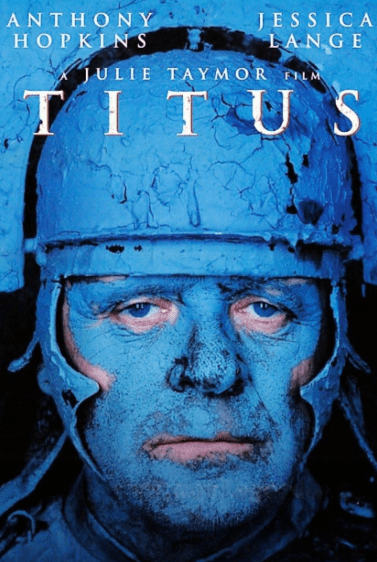
Photo Credit: Fox Searchlight
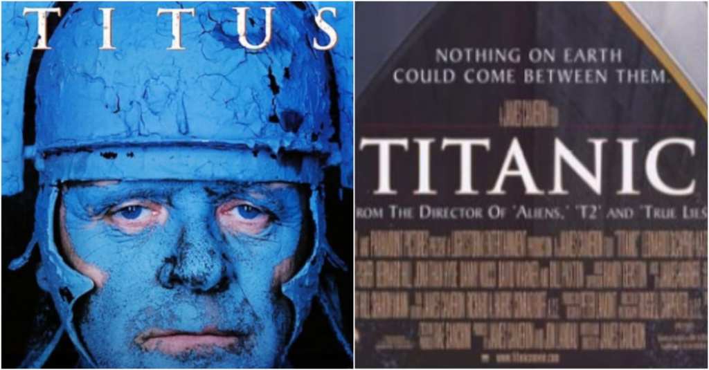
The familiar font is called Trajan, and it was designed by a woman named Carol Twombly in 1989. Twombly worked for Adobe, and the font became extremely popular because many designers used Adobe software to create movie posters. This signaled a change in the movie poster industry. The first film to use the font in its advertisements was At Play In the Fields of the Lord.
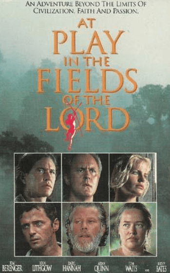
Photo Credit: Universal Pictures
Other designers caught on to Trajan and soon the font was seen everywhere in film advertising. These days, Trajan is used more for direct-to-video and B and genre movies.

Photo Credit: Sony Pictures
Watch the video below for more about the history of the font and its use:
Designers use Trajan to give movies more of an “epic” feel, even if they are low-budget horror films. We’re talking about advertising here, remember?


