
Trending Now

There were maps on the walls of our classrooms every year of our childhood. We look at them to get around (some of us even use maps on paper!), and Google uses them to help us get from point A to point B.
But it turns out those maps aren’t entirely accurate.
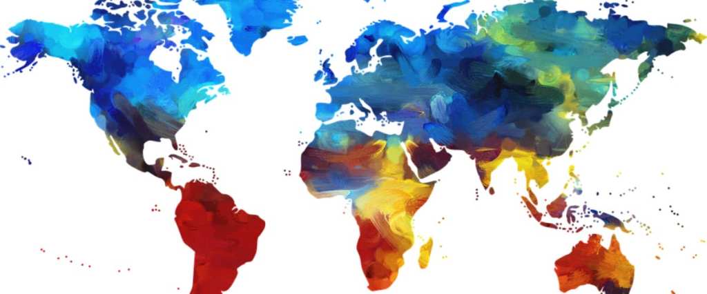
Because it is likely that every map you’ve ever seen is based on the Mercator projection, which was designed almost 450 years ago and has some pretty serious flaws.
https://www.instagram.com/p/BzN_SfrJRYC/
It was presented by Flemish cartographer Gerardus Mercator in 1569, and though it’s been useful for exploration – it allows for the plotting of a straight-line course on a globular planet and maintains the true shape of a country – translating a three-dimensional globe into two-dimensional map distorts both size and distance the closer you get to the poles.
So, maps haven’t been reflecting the size of many countries accurately since, well…forever.
Not only that, but the map has been accused of having political undertones that reinforce a Eurocentric colonial view of the world.
https://www.instagram.com/p/BzN60v_BaE3/
Now, though, companies like Yahoo and Google are using an Equal Earth projection map created by a group of contemporary cartographers in 2018 – one that overcomes many of the numerous issues with the Mercator projection.
Climate data scientist Neil Kaye created a map visualization that alternates between the Mercator projection and the true projections, and the resulting GIF is pretty fascinating to watch.
Russia, Canada, and Greenland completely changed size, while parts of Europe, Asia, and the Americas also shrink quite a bit.
In original maps, Greenland appears larger than Africa when, in reality, they’re not even close – Africa is 14x bigger than Greenland.
“Each country is projected to the spherical projection and placed at the center of where it appears in the Natural Earth projection,” he explained on Reddit. “There was then some manual tweaking of countries that are closer to the poles. …This demonstrates you can’t fit shapes on a sphere back together again once you put them on the flat.”
So even though this map gives us more accurate country size, it still doesn’t give us entirely accurate country shape.
That’s just a reality of geometry – you can’t reproduce the surface of a 3-d object entirely faithfully on a 2-d plane.
But in the name of people who enjoy accuracy everywhere, I say bring on the (more) correct maps of the world!
I wonder how many classrooms are going to need new maps, though.
Oh, well, I’m sure the teachers can afford it. (sarcasm font)


