
Trending Now

Most of us go through our lives not really thinking a whole lot about how we space out our words. We write, we type, the word processor does it for us most of the time, and so we remain blissfully unaware of how close we might have come to disaster.
Once you’re talking about graphics, though, specifically ones that people are going to read printed out on signs, you’re not allowed to not really consider your spacing anymore.
Wondering what, exactly, I’m talking about? Here are 11 great examples that will open your eyes.
11. I would 100% park on the Pupper Level.
It sounds way better than the Upper Level.
The pupper level sounds WAY more fun to be honest.
byu/mazokugirl451 inkeming
10. We can’t argue with that, kid.
I’m impressed with his reading skills, honestly.
I’m glad kids are learning an excitement for animals at such a young age
byu/DullUselessDinosaur inkeming
9. I don’t think they reward people for that.
If they do, my shelves should be a lot fuller.
A trophy
byu/vnenkpet inkeming
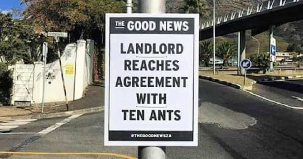
8. Is it wrong that I feel sorry for the 11th ant?
It’s tough to just miss the cutoff like that, dang.
7. OK this was definitely on purpose though.
I could not love this more.
6. I’m just gonna stop you right there.
No one requested that, I’m pretty sure.
5. That’s a conversation starter right there.
Good or bad, depending on your personality.
[deleted by user]
by inkeming
4. This sign caused so many existential crises.
I don’t think that’s typically the goal of the church.
God is nowhere
by inkeming
3. Some people just choose violence.
It’s who they are, deep down on the inside.
2. This is just hilarious.
I refuse to believe that no one noticed it before it was put up.
When you eat too much curry for lunch…
byu/quackingrobot inkeming
1. I have to think better choices could have been made her.
But then we wouldn’t all be snickering, so.
I am sort of wheezing I’m laughing so hard, y’all.
What’s your favorite example of this that you’ve encountered? Share it with us in the comments!


