Trending Now
Marketing strategies make or break a business. That’s why there are entire degrees dedicated to graphic design.
Sometimes, an at-home DIY design can take a pretty cringe-worthy turn. Here are 13 facepalm-inducing design fails that sure to make you ask – what the heck were these people thinking?
While we’re at it, here are some more epic fails to tickle your fancy.
1. That’s messy
Whatever she’s having – I don’t want it.
Kind of a crappy design if you ask me
byu/i_like_miniwheats indesignfails
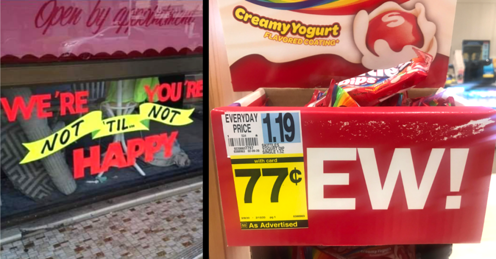
2. Grammar?
Not quite sure how one’s supposed to read this. Every combination I’ve tried makes no sense.
We’re You’re Not ‘Til Not Happy?
byu/FanTASticGeronimo indesignfails
3. Liquids!
Orange milk is my favorite.
4. Just slightly off
That’s one way to get into the holiday spirit.
5. This is so unfortunate
I guess it makes the library a little bit more exciting.
My local library uses the three last letters of authors names
byu/Relskib inShittyDesign
6. That’s unfortunate
Well, at least they’re honest about their product.
7. This is the future
I can’t wait until we finally splice enough of our DNA with AI to do this.
Click here on a newspaper
byu/i_like_miniwheats indesignfails
8. In a quarantined world
Desperate times call for desperate measures.
Feel like this should be here
byu/BluelightTheCursed indesignfails
9. Interesting placement
Not sure what Sanrio was trying to go for here.
The New Hello Kitty Water Cooler Is…..Interesting.
byu/boy_on_a_string inShittyDesign
10. Thank you, Captain Obvious
Seriously, do people proofread any of this stuff?
Hmm yes, the floor here is made out of floor
by indesignfails
11. Oh no
I guess this is a concert you’ll never forget?
Ohhhhh, you mean Capital JAzz Fest
byu/neuroticsmurf indesignfails
12. What
Are you paying for the napkins?
Would you like your chips with or without chips?
byu/ZodiacWarrior_ inCrappyDesign
13. An entirely different message
That’s pretty nasty placement for a slogan on a door.
Didn’t think about the doors being open did they?
byu/isaacthemadman7274 indesignfails
Whenever times get rough, at least I know that I haven’t quite made a major public faux pas like the ones we see above.
This is exactly why my twitter account is private.
But hey, enough about me… what do you think about these design fails? Let us know in the comments!


