

We should know by now that trusting what we see online or on television without checking facts or applying critical thinking is the fastest way to go insane, but when we’re presented with facts that show what a large disconnect exists between media and reality, it can still be jarring.
And that’s exactly the feeling many people got after checking out this hard data on the causes of death in America (thanks to Bill Gates for posting it).
Because even though they’re not sensational or visually terrifying or able to be used as a tool to control the masses in some way, heart disease and cancer are still far and away the biggest killers stalking American streets.
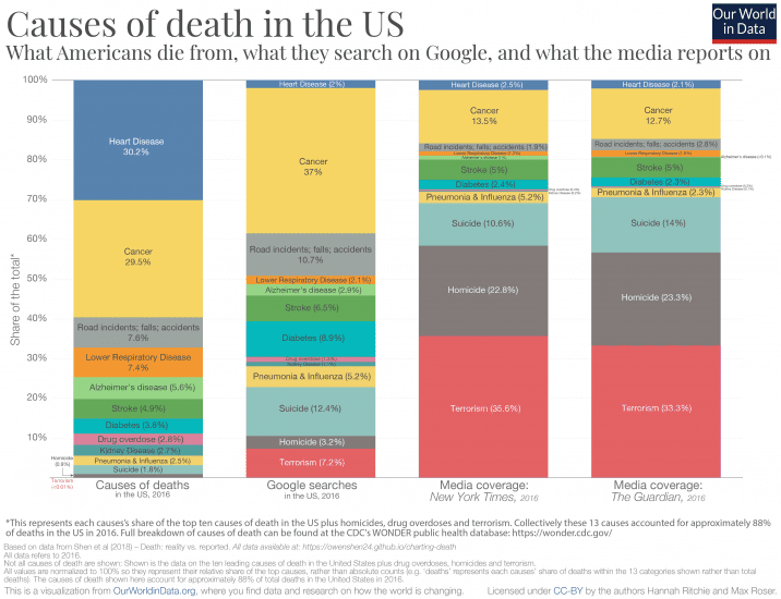
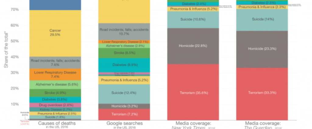
Image Credit: Our World In Data
The infographic compares a chart showing causes of death, proportionally, to charts showing how often those causes are Googled, covered by mainstream media outlets in the US, and covered by mainstream media outlets in the UK.
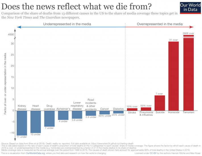
Image Credit Our World in Data
Across the board, the “sensational” ways to die get coverage (and searches) disproportionate to their actual likelihood of killing us.
https://twitter.com/bradleyvoytek/status/1138596712144969728
The data was compiled from the results of a project known as Death: Reality vs. Reported that was done by students at the University of California San Diego, who attempted to answer these questions:
- How do people die?
- How do people think they die?
- Is there a difference?
They used four sources to find answers – the CDC’s WONDER database, Google Trends search volume, the Guardian’s article database, and the New York Times’ article database – and concluded:
“For all of the above data, we looked at the top 10largest causes of mortality, as well as terrorism, overdoses, and homicides, three other causes of death which we believe receive a lot of media attention. Immediately, we can see that cancer and heart disease take up a major chunk of all deaths, each responsible for around 30% of the total death count. On the graph, everything is visible except for terrorism, which is so small it doesn’t show up unless we zoom in.”
When they move over to analyzing people’s Google searches for causes of death, terrorism, you can see, is far over-represented, and the same goes for newspapers – terrorism, cancer, and homicides are mentioned most often, even though they should be much smaller in proportion to cancer and heart disease.
“After looking at our data, we found that, like results before us, the attention given by news outlets and Google searches does not match the actual distribution of deaths. This suggests that general public sentiment is not well-calibrated with the ways that people actually die. Heart disease and kidney disease appear largely underrepresented in the sphere of public attention, while terrorism and homicides capture a far larger share, relative to their share of deaths caused.”
If you find this interesting, you’re not alone – Twitter experienced some eye-opening, come to Jesus moments, as well.
https://twitter.com/robertchihade/status/1138522258933030912
We really need to think more about this kind of thing.
And not just accept what the media feeds us.
Because the truth always comes out in the long run.
https://twitter.com/K1ngadam/status/1138531231270875137
As always – the more you know!


