Is global warming a hoax?
Are we just experiencing a “warming cycle?”
Do you like infographics?
One of those answers is an easy “yes.”
Randall Munroe at xkcd.com has compiled climate change research into a handy and exhaustively scrollable infographic that charts the average global temperature over the last 22,000 years:
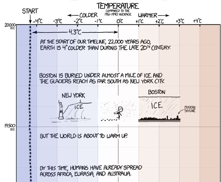
Photo Credit: XKCD.com/Randall Munroe
SPOILER ALERT: It doesn’t seem to end well:
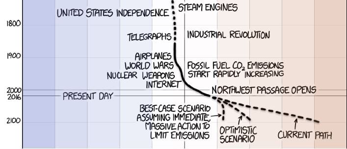
Photo Credit: XKCD.com/Randall Munroe
But I wouldn’t have shown you that if this chart wasn’t about the journey.
Anybody could have drawn up a chart showing how the average temperature has spiked since the Industrial Revolution in comparison to the overall history of humanity, but gems like this help to put it all into perspective and to keep it fun:
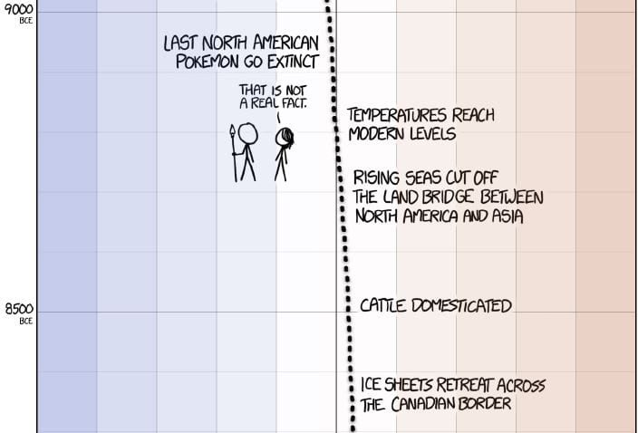
Photo Credit: XKCD.com/Randall Munroe
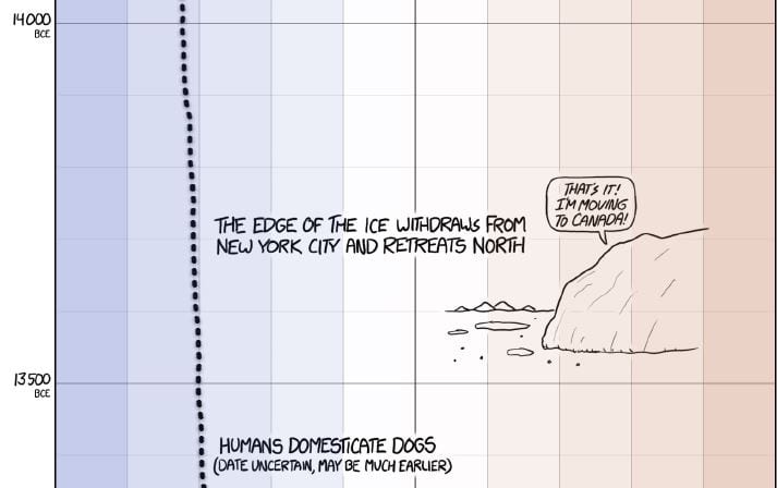
You need to take the bulk of the human journey before you see that last section to really appreciate both the macro and the micro. And, you need humor to get you there:
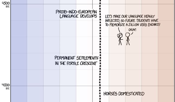
Photo Credit: XKCD.com/Randall Munroe
It’s really no wonder that Munroe took home the top prize in Data Visualization at the 2016 Information is Beautiful Awards.
Enjoy:

Photo Credit: XKCD.com/Randall Munroe
Want more infographics?
- US Map Shows How High Your Salary Needs to Be to Buy a House
- 8 Crazy Facts (and a Ridiculously Badass Graphic) About Albert Einstein
- Infographic: What Does Your Poo Say About You?
- 20 Cognitive Biases That Can Really Screw with Your Decision Making
- This Map Shows the Most Frequently Used Word on Every Country’s Wikipedia Page

