

Everyone loves maps. I mean, not as much as they love cats, dogs, and mocking Instagram influencers, but still – it’s a lot.
I think after checking out the Facebook page Terrible Maps, though, that bad maps might be better than awesome maps (though they are both, of course, better than no maps at all).
Here are 14 hilariously terrible maps, so you can decide for yourself.
14. I don’t know why we need this.
But I’m not sorry I’ve seen it.
13. This is because only like 5 people in each state know soccer players.
Also, calling it soccer is so cringe!
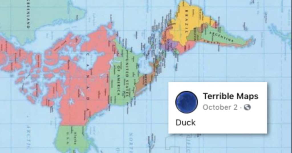
12. I snorted.
I couldn’t help it.
11. All alone yet again.
I guess we kind of like it that way.
10. If you use a loose interpretation of the word “English.”
Very loose, in some cases.
9. At least it’s accurate.
The Romans were good, but not that good.
8. At least it’s accurate.
I don’t know about you, but I love to see it.
7. Like a cloud, but harder to wrap your mind around.
More colorful, though.
6. So wrong.
That doesn’t mean it’s not funny, though.
5. So many versions.
All of them amazing.
4. Anyone overlooked?
Nope, I don’t think so.
3. Maybe.
I’m not saying for sure, just…maybe we should think about it?
2. Looks familiar from across the pond.
A little too much so.
1. Poor New Zealand.
Except maybe they’re onto something because they don’t have room for all of us.
Tell me you’re not at least smiling and shaking your head right now!
Which of these was your favorite? Share with us in the comments.


