When you run a business, it’s all about building your brand. And one of the best ways to do that is through your logo and your signage.
There’s nothing worse than when something goes wrong–it seems like it could cost you a lot of money to do over. Some businesses choose to live with it rather than paying to have it redone.
And who can blame them. When you mess up your only job, how do we know you’ll get it right the second time?
Here are 14 classic examples of cringe-worthy sign fails from the subreddit r/NotMyJob.
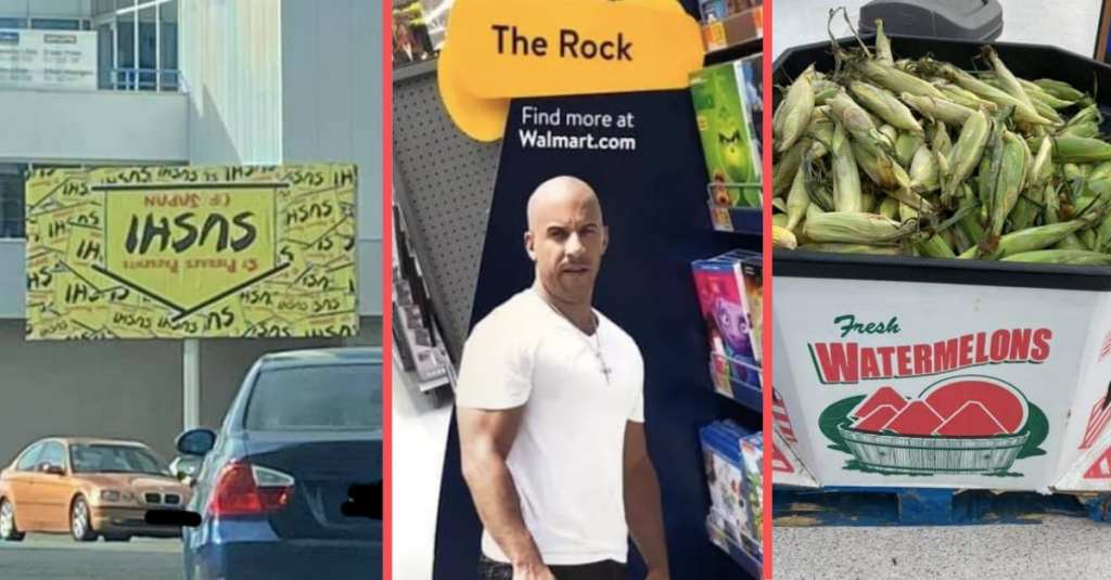
1. Welcome to the Upside-Down
It’s fine as long as they can read it, right?
2. Still needs Spanish
But at least they know their weaknesses, I guess.
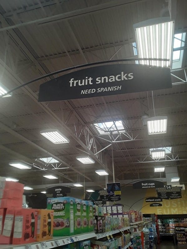
Image credit: r/NotMyJob via Pleated Jeans
3. Which came first?
Either way, the signs might be the easiest part to fix.
4. Levitate here to see how you measure up
No cheating now.
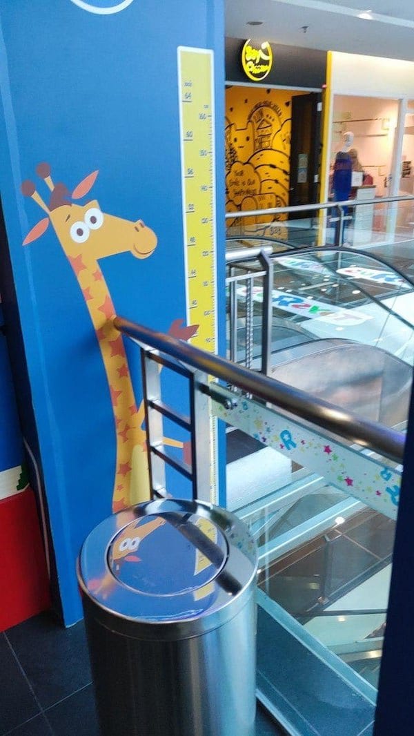
Image credit: r/NotMyJob via Pleated Jeans
5. Nothing to see here. Just a paint store.
You might have to read it again.
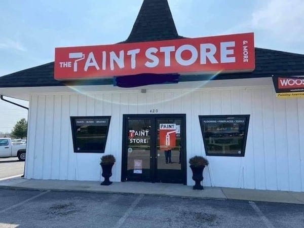
Image credit: r/NotMyJob via Pleated Jeans
6. Watermelons for everyone
This one is maybe not the sign’s fault.
7. 20 years experience
Will accept years worked in childhood and earlier.
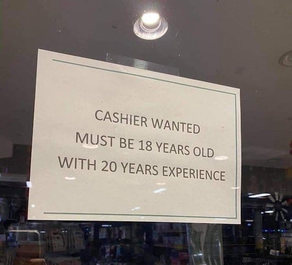
Image credit: r/NotMyJob via Pleated Jeans
8. Here we go again
They did their best.
9. When you can’t tell your Rock from a Vin on the ground
Bald action stars everywhere are taking offense.
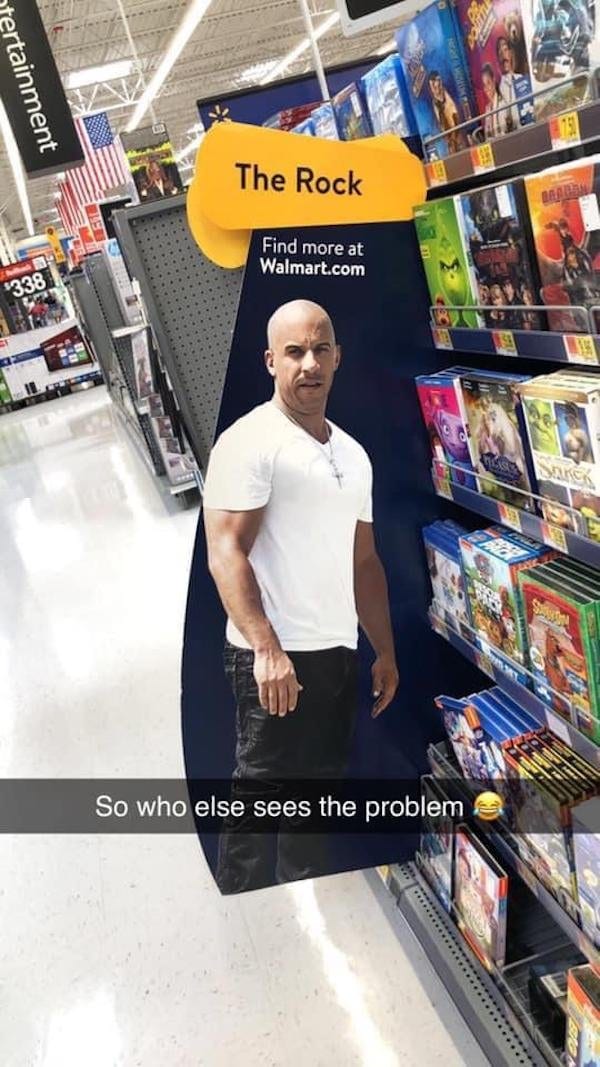
Image credit: r/NotMyJob via Pleated Jeans
10. Nothing is impossible
Even reading white paint on a white background.
Try harder.
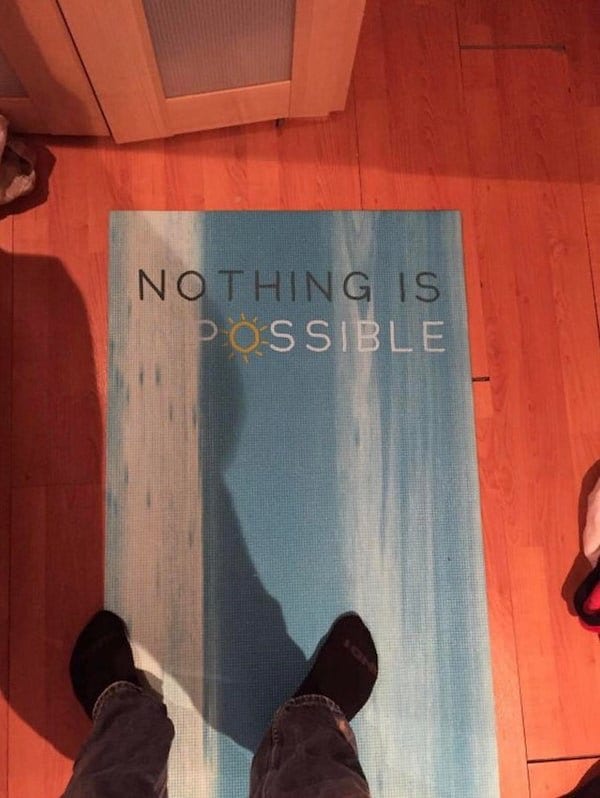
Image credit: r/NotMyJob via Pleated Jeans
11. Sneaking in is welcome!
Honestly, maybe it’s a hidden message to scrappy local teens in need of wholesome mischief.
12. Upside-down again
These things really need to come with ‘this way up’ markers.
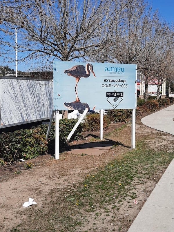
Image credit: r/NotMyJob via Pleated Jeans
13. Sometimes they have instructions
But you still have to read them.
Its probably not a big deal anyways dude
byu/leftHandedFootball inNotMyJob
14. And make sure they’re facing the right way round
Quick tip: road signs should face the road.
Re-installed the speed limit sign facing our backyard, instead of the highway.
byu/AnalRapist69 inNotMyJob
These mistakes are absolutely cringe-worthy, but what can you do?
We’re all just doing our best, even when the best we have to offer isn’t the best we’re capable of.
Have you seen any great sign mishaps?
Share them in the comments.

